
Post #1 · Posted at 2014-05-20 01:35:37am 12 years ago
 370K 370K | |
|---|---|
 |
Banned |
| 70 Posts | |
 | |
| Reg. 2013-12-21 | |
 | |
| "Single, in a HyperNOVA..." | |
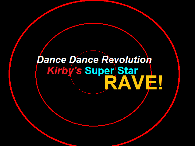
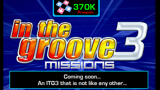
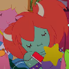
I remember I made a theme called "DDR Kirby's Super Star RAVE!", which is a re-graphic version of TakuyaMAXX's DDR EXTREME theme. Anyway, I never released the theme since I have discovered OpenITG (StepMania 3.95). Since I've gotten into making simfiles with Kirbies in the BN+BG, I may as well create my own build of a DDR simulator! It may take a long time to consume since I am working on the In The Groove 3 Missions theme, which will be released in the summertime. The theme has been abandoned for 2 years.
DDR Kirby's Super Star RAVE!:
In The Groove 3 Missions:
Comment below if you have any questions about the build!
-370K
DDR Kirby's Super Star RAVE!:
In The Groove 3 Missions:
Comment below if you have any questions about the build!
-370K
Post #2 · Posted at 2014-05-20 04:17:12am 12 years ago
| CrzP | |
|---|---|
 |
Member |
| 36 Posts | |
 | |
| Reg. 2014-02-21 | |
Guess this is a stepmania 3.95 theme?Well...I'm using stepmania 5.A theme for 3.95 isn't popular than it before.
Anyway,I'll look forward this theme.(^V^)
Anyway,I'll look forward this theme.(^V^)
Post #3 · Posted at 2014-05-22 01:54:56am 12 years ago
Quote: CrzP
Guess this is a stepmania 3.95 theme?Well...I'm using stepmania 5.A theme for 3.95 isn't popular than it before.
Anyway,I'll look forward this theme.(^V^)
Anyway,I'll look forward this theme.(^V^)
It's actually a StepMania 3.9, like beware's DDR EXTREME. Concluding that, the simfiles I have made will have their ROLLS removed for the release (because it's not 3.9 PLUS).
CONCEPTS OF THE SIMULATOR:
Sure, this is quite like beware's DDR EXTREME. Although, there are some secrets in the game! These secrets are the fact that some of the songs will have an alternative difficulty, which are UNRELEASED steps that were too hard for gameplay. These will only be found in
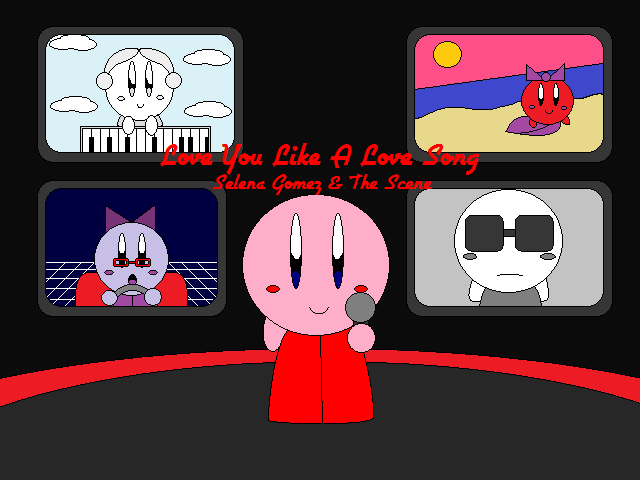
Here is an example:
Love You Like A Love Song
0111010101000
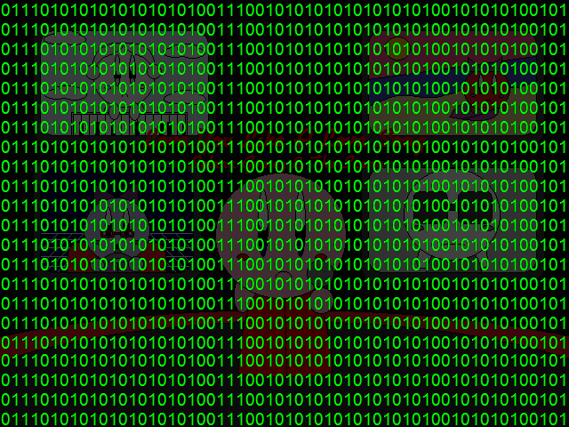
NOTICE:
The song Love You Like A Love Song no longer has its name in the alternative version. The alternative version has the BG censored with all green numbers of binary. The BG is still visible, but you'll notice that something is different about it...!
Alternative versions are only playable in
Stay tuned for more concepts! There will be more!
-370K
Post #4 · Posted at 2014-05-22 02:02:01am 12 years ago
| SM MaxX | |
|---|---|
 |
Member+ |
| 911 Posts | |
| | |
| Reg. 2012-08-30 | |
 | |
| "I play too much touhou" | |
I'm not really sure what I'm looking at here.
This is a theme you're making? because it sounds more like just some sort of simfile project than anything else.
This is a theme you're making? because it sounds more like just some sort of simfile project than anything else.

Post #5 · Posted at 2014-05-22 02:06:19am 12 years ago
| 370K | |
|---|---|
|
Banned |
| 70 Posts | |
| | |
| Reg. 2013-12-21 | |
| |
| "Single, in a HyperNOVA..." | |
Quote: SM MaxX
I'm not really sure what I'm looking at here.
This is a theme you're making? because it sounds more like just some sort of simfile project than anything else.
This is a theme you're making? because it sounds more like just some sort of simfile project than anything else.
It's not only a theme, it's actually a build like bewares. Although, it's got some modifications on the game itself.
-370K
Post #6 · Posted at 2014-05-22 02:19:02am 12 years ago
| SM MaxX | |
|---|---|
|
Member+ |
| 911 Posts | |
| | |
| Reg. 2012-08-30 | |
| |
| "I play too much touhou" | |
I'm seeing Extreme, ITG 3, and kirby super star, and the only word that comes to mind is "clusterfuck"
also I'm sorry, but even for 3.9 standards, if the pictures I'm seeing are what most of the game is gonna look like I hope you plan on switching to something other than mspaint for your gfx because this is really subpar
also I'm sorry, but even for 3.9 standards, if the pictures I'm seeing are what most of the game is gonna look like I hope you plan on switching to something other than mspaint for your gfx because this is really subpar
Post #7 · Posted at 2014-05-22 02:24:56am 12 years ago
| 370K | |
|---|---|
|
Banned |
| 70 Posts | |
| | |
| Reg. 2013-12-21 | |
| |
| "Single, in a HyperNOVA..." | |
Quote: SM MaxX
I'm seeing Extreme, ITG 3, and kirby super star, and the only word that comes to mind is "clusterfuck"
also I'm sorry, but even for 3.9 standards, if the pictures I'm seeing are what most of the game is gonna look like I hope you plan on switching to something other than mspaint for your gfx because this is really subpar
also I'm sorry, but even for 3.9 standards, if the pictures I'm seeing are what most of the game is gonna look like I hope you plan on switching to something other than mspaint for your gfx because this is really subpar
FYI... This game is supposed to look CREATIVE, it's not like it's a real arcade simulator! The only way I make my graphics is with MS Paint. It doesn't matter what program you use to make graphics, it's how you enjoy using it.
-370K
Post #8 · Posted at 2014-05-22 02:53:58am 12 years ago

Post #9 · Posted at 2014-05-23 01:29:49am 12 years ago
Quote: Lisek
Umm, that's not very necessary but I'll give it a shot. Thank you.
-370K
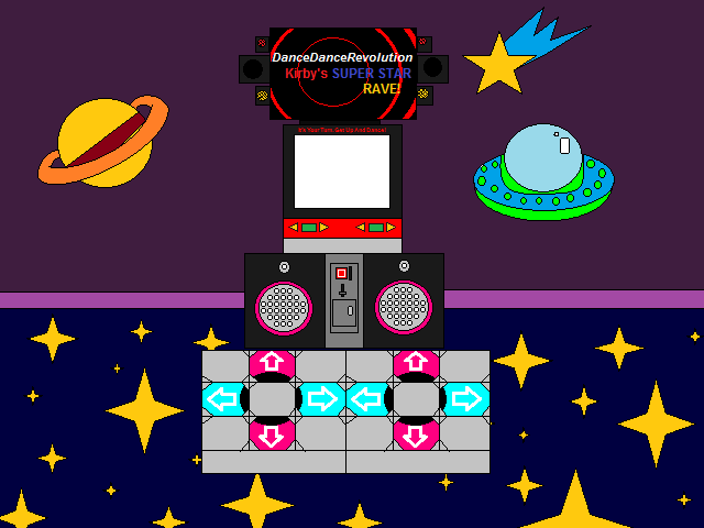
HISTORY OF THE SIMILATOR:
Way back before the theme was abandoned, I remember creating a cute little model of a DDR machine labeled with my theme.
Therefore, the DDR machine is running DDR Kirby's Super Star RAVE! in the cabinet!

<3
-370K
Post #10 · Posted at 2014-05-23 02:04:56am 12 years ago
| Air12567 | |
|---|---|
 |
Member |
| 653 Posts | |
 | |
| Reg. 2006-05-27 | |
Quote: 370K
Way back before the theme was abandoned, I remember creating a cute little model of a DDR machine labeled with my theme.
Therefore, the DDR machine is running DDR Kirby's Super Star RAVE! in the cabinet!
Your "theme" looks like DDR Max rankings.

Post #11 · Posted at 2014-05-24 04:15:03pm 12 years ago
FEATURES OF THE SIMULATOR:
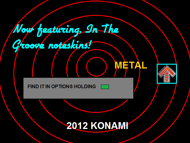
In the Attract Mode sequence, you will see that the METAL noteskin (In The Groove) is featured in the game. METAL is the only outside noteskin in the game, the rest are DDR noteskins. Here's a ripped image from the game:
I still need to clean it up... lol
-370K
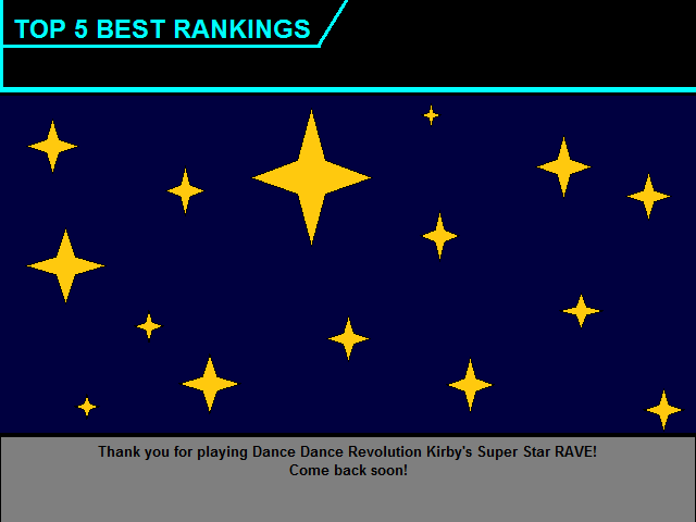
RIPPED IMAGES FROM THE SIMULATOR:
Here are some of the graphics ripped from the game:
Screen Ranking
Screen NameEntry
Screen MusicScroll
Screen Caution (was Screen MemoryCard)
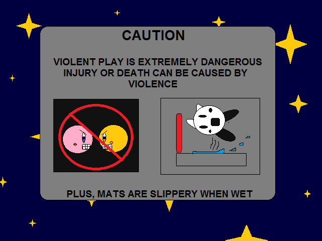
Screen Warning (with DDR EX description)
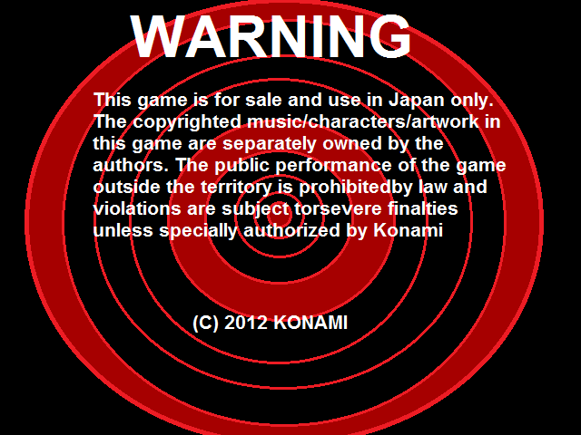
Screen Unlock (not present in game)
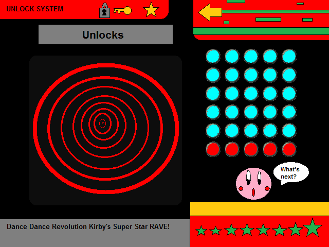
-370K
In the Attract Mode sequence, you will see that the METAL noteskin (In The Groove) is featured in the game. METAL is the only outside noteskin in the game, the rest are DDR noteskins. Here's a ripped image from the game:
I still need to clean it up... lol
-370K
RIPPED IMAGES FROM THE SIMULATOR:
Here are some of the graphics ripped from the game:
Screen Ranking
Screen NameEntry
Screen MusicScroll
Screen Caution (was Screen MemoryCard)
Screen Warning (with DDR EX description)
Screen Unlock (not present in game)
-370K
Post #12 · Posted at 2014-05-25 01:02:21am 12 years ago
| CrzP | |
|---|---|
|
Member |
| 36 Posts | |
| | |
| Reg. 2014-02-21 | |
Well.....you really need something powerful to create graphics...these graphics are too simple and 'not good-looking'.
I don't want to complain it,but it needs improvement indeed.
Go and buy a Photoshop.Then you'll find world is smiling to you.(^V^)
I don't want to complain it,but it needs improvement indeed.
Go and buy a Photoshop.Then you'll find world is smiling to you.(^V^)
Post #13 · Posted at 2014-05-26 12:56:52am 12 years ago
| 370K | |
|---|---|
|
Banned |
| 70 Posts | |
| | |
| Reg. 2013-12-21 | |
| |
| "Single, in a HyperNOVA..." | |
Quote: CrzP
Well.....you really need something powerful to create graphics...these graphics are too simple and 'not good-looking'.
I don't want to complain it,but it needs improvement indeed.
Go and buy a Photoshop.Then you'll find world is smiling to you.(^V^)
I don't want to complain it,but it needs improvement indeed.
Go and buy a Photoshop.Then you'll find world is smiling to you.(^V^)
O.O
Dear.....
This theme is from 2 years ago (as I posted first thing), and if I'm continuing to work on it, then I have to make it "old-fashioned." Or else the theme's going to look too recent, and that will not look fitting to an OLD theme.
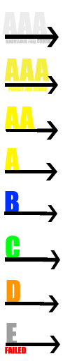
Although I have used Photoshop to take care of some graphics in the game, such as these ripped graphics:
Judgment
Hold Judgments

Grades
UNLESS, when I release the build, maybe you can try to make an "improved" version of my theme!
-370K
Post #14 · Posted at 2014-05-26 02:07:46am 12 years ago
| King_Mew | |
|---|---|
 |
Member |
| 273 Posts | |
| | |
| Reg. 2012-06-27 | |
 | |
| "Dream Goes On" | |
Honestly, I think it looks pretty okay.
I mean, it's not good. The art is quite... crude, but it looks like you've actually put effort into it, unlike some other themes I've seen.
I recommend trying out GIMP or any other, better graphics program. Good graphics are pretty much the most important part of a theme. With some more advanced tools, you could make this theme a lot better.
It's obviously not the best I've seen, but we all have to start somewhere. Keep working and maybe I'll download this.
Well, I would download it if it weren't for Stepmania 3.95
 Rippin' bro, you cleared it!
Post #15 · Posted at 2014-05-26 07:09:38am 12 years ago
| 370K | |
|---|---|
|
Banned |
| 70 Posts | |
| | |
| Reg. 2013-12-21 | |
| |
| "Single, in a HyperNOVA..." | |
RIPPED IMAGES FROM THE SIMULATOR:
~The Next Page~
Beginner Helper (not used in game)
*It's simply a drawing of the arcade machine...
How To Play
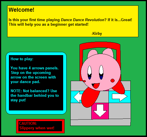
CHALLENGE MODE Warning
Cute or what? You tell me! <3
-370K
~The Next Page~
Beginner Helper (not used in game)
*It's simply a drawing of the arcade machine...
How To Play
CHALLENGE MODE Warning
Cute or what? You tell me!
-370K
Post #16 · Posted at 2014-05-26 09:59:07am 12 years ago
| Oni-91 | |
|---|---|
 |
Moderator+ |
| 13,526 Posts | |
| | |
| Reg. 2006-10-20 | |
 | |
| "Popular bisexual disaster" | |
The only time anyone should use MSPaint for theming is Paintmania. And since that has been done already, just don't do MSPaint theming.
Post #17 · Posted at 2014-05-26 01:19:38pm 12 years ago
| DDR Addict | |
|---|---|
 |
Member |
| 1,475 Posts | |
| | |
| Reg. 2009-09-23 | |
| |
| "Let's Do the Rain Dance" | |
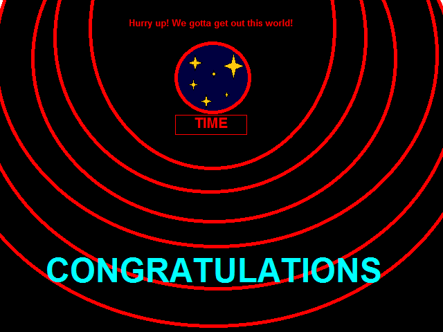
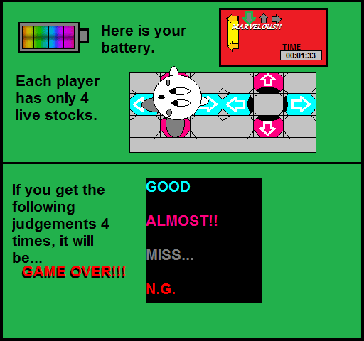
I like the art style but not its execution. I think one of the big problems is that, while you seem to be aiming for a simplistic motif for some elements, it's rather inconsistent.
For example, in this one, you appear to be attempting some perspective in the upper right quadrant. This could end up looking impressive, but there are two fatal flaws: Kirby and the gameplay. First off, his position doesn't make much sense since his entire body is facing backwards and, even if he was in the middle of turn, his face is tilted in a very weird way. Also, the fact that it seems like his body was made facing straight and then tilted 45 degrees does strike the viewer as a bit lazy, though I do concede that it is nice that you changed around the feet size for perspective. The other problem is the the game screen. Primarily, why an in-game screenshot wasn't used here is a bit confusing. As it stands, the TIME meter is far too large, taking up a quarter of the screen's real estate. The choice of a flat red background also doesn't look good to the eyes, and brings me to my big point:
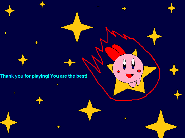
With the admittedly detailed battery meter and the relatively well-done pads standing around this flat green and red background with rather plain fonts, it doesn't all match. Are you trying to go for a more detailed Super NES-caliber type style, a minimalist more fitting for NES style, or maybe even a style reminiscent of a modern DDR title? Judging by the responses this thread has been getting, I'd suggest going for the first or last option. Another suggestion I have is to maybe make this tie in further to the Kirby franchise in at least some elements; it helps give the theme a little more personality. I mean, at this point, all that really relates is the star in the Thank You for Playing Screen and Kirby himself. Also, you need to learn to shade, because a lot of your art (such as the pads) has good detail, but the flat colors hurt the overall look.
To illustrate what to change, I decided to do a little mockup of this type of screen with a Kirby twist:

Yes, it still isn't amazing (mainly because I suck) but there are a few things I tried to take care to do:
- Make it more Kirby: Instead of a traditional battery, I thought perhaps a recognizable object from the Kirby series would make for a good life meter. In this case, I chose the star block that you can form as Stone Kirby in Super Star Ultra, with a bit of modification to make it look less pixelated. In addition, I made a little nod to the Gourmet Race minigame which has appeared in several Kirby games. Those little textual reminders can really make gamers appreciate the fact that you did your research on the topic and make you appear even better in their eyes.
- Make the text less plain: For this one, I have to thank silverdragon, whose BEMANI font pack has given me a treasure trove of fonts that help give a more modern edge. However, I should also mention at this point that I do not use Paint but in fact Photofiltre, a free image editor that isn't that complex to work with but has so many more functions than Paint such as multitasking with images, pixel-precise identification, many filters, and (germane to this) text options such as drop shadows and bevels. Trust me: only in a minimalist setting will you ever want to use plain text again!
- Keeping it modern: I already mentioned the text and star blocks, but I've also tried to keep the image looking modern in other ways. The background (while a generic since this is just a mockup) looks like something that would fit in DDR, and the gameplay screen is an actual gameplay screen (Chrystalize, but again, this is a mockup). The pad is a real-life one, though perhaps it would've been better (with more time) to stylize it in a cel-shaded way. Kirby himself has good shading and looks like he is in a logical position from the steps on the gameplay screen, regardless of whether you're looking at Player 1 and Player 2 (I would've used a different screenshot, but again, mockup). Before you say "but that's official art! I can't make it look that good!", know that trying to take cues from art like that to understand shading will help get it up to that level in time. Heck, even if you stick to pixel art, the Super Smash Flash team shows that you do good shading in that style as well!

So, I hope you can take something away from this, because I really am trying to help you look better to my fellow ZIV members, and keeping on the same path for this theme as you are at current is not going to help their perception of your efforts, which at the moment are "he's got some good ideas and can do some emotion and style, but his medium and technique are definitely holding him back".
Quote
For example, in this one, you appear to be attempting some perspective in the upper right quadrant. This could end up looking impressive, but there are two fatal flaws: Kirby and the gameplay. First off, his position doesn't make much sense since his entire body is facing backwards and, even if he was in the middle of turn, his face is tilted in a very weird way. Also, the fact that it seems like his body was made facing straight and then tilted 45 degrees does strike the viewer as a bit lazy, though I do concede that it is nice that you changed around the feet size for perspective. The other problem is the the game screen. Primarily, why an in-game screenshot wasn't used here is a bit confusing. As it stands, the TIME meter is far too large, taking up a quarter of the screen's real estate. The choice of a flat red background also doesn't look good to the eyes, and brings me to my big point:
With the admittedly detailed battery meter and the relatively well-done pads standing around this flat green and red background with rather plain fonts, it doesn't all match. Are you trying to go for a more detailed Super NES-caliber type style, a minimalist more fitting for NES style, or maybe even a style reminiscent of a modern DDR title? Judging by the responses this thread has been getting, I'd suggest going for the first or last option. Another suggestion I have is to maybe make this tie in further to the Kirby franchise in at least some elements; it helps give the theme a little more personality. I mean, at this point, all that really relates is the star in the Thank You for Playing Screen and Kirby himself. Also, you need to learn to shade, because a lot of your art (such as the pads) has good detail, but the flat colors hurt the overall look.
To illustrate what to change, I decided to do a little mockup of this type of screen with a Kirby twist:
Yes, it still isn't amazing (mainly because I suck) but there are a few things I tried to take care to do:
- Make it more Kirby: Instead of a traditional battery, I thought perhaps a recognizable object from the Kirby series would make for a good life meter. In this case, I chose the star block that you can form as Stone Kirby in Super Star Ultra, with a bit of modification to make it look less pixelated. In addition, I made a little nod to the Gourmet Race minigame which has appeared in several Kirby games. Those little textual reminders can really make gamers appreciate the fact that you did your research on the topic and make you appear even better in their eyes.
- Make the text less plain: For this one, I have to thank silverdragon, whose BEMANI font pack has given me a treasure trove of fonts that help give a more modern edge. However, I should also mention at this point that I do not use Paint but in fact Photofiltre, a free image editor that isn't that complex to work with but has so many more functions than Paint such as multitasking with images, pixel-precise identification, many filters, and (germane to this) text options such as drop shadows and bevels. Trust me: only in a minimalist setting will you ever want to use plain text again!
- Keeping it modern: I already mentioned the text and star blocks, but I've also tried to keep the image looking modern in other ways. The background (while a generic since this is just a mockup) looks like something that would fit in DDR, and the gameplay screen is an actual gameplay screen (Chrystalize, but again, this is a mockup). The pad is a real-life one, though perhaps it would've been better (with more time) to stylize it in a cel-shaded way. Kirby himself has good shading and looks like he is in a logical position from the steps on the gameplay screen, regardless of whether you're looking at Player 1 and Player 2 (I would've used a different screenshot, but again, mockup). Before you say "but that's official art! I can't make it look that good!", know that trying to take cues from art like that to understand shading will help get it up to that level in time. Heck, even if you stick to pixel art, the Super Smash Flash team shows that you do good shading in that style as well!
So, I hope you can take something away from this, because I really am trying to help you look better to my fellow ZIV members, and keeping on the same path for this theme as you are at current is not going to help their perception of your efforts, which at the moment are "he's got some good ideas and can do some emotion and style, but his medium and technique are definitely holding him back".
Post #18 · Posted at 2014-05-26 05:35:56pm 12 years ago
| bmhedgehog | |
|---|---|
 |
Banned+ |
| 3,136 Posts | |
| Not Set | |
| Reg. 2008-07-13 | |
| "BANNED" | |
okay I need to chime in.
This is 370K's Theme Project and no one else's. I know that everyone wants to help and try to provide constructive criticism, but if 370K doesn't want to use Photoshop or GIMP then that is his choice. So please everyone, please respect 370K's choice. I've got a feeling that if you guys keep putting pressure on him, he will most likely stop this project and never release it.
If I was working on a theme and did the same thing, you all would be putting pressure on me to do the same thing then even I would feel like giving up and stop the project and not release it.
So please everyone let him do this. Let him go about this project his own way. If you don't like the way he's working on it then don't download the theme.
Post #19 · Posted at 2014-05-26 06:04:04pm 12 years ago
| 370K | |
|---|---|
|
Banned |
| 70 Posts | |
| | |
| Reg. 2013-12-21 | |
| |
| "Single, in a HyperNOVA..." | |
Quote: bmhedgehog
okay I need to chime in.
This is 370K's Theme Project and no one else's. I know that everyone wants to help and try to provide constructive criticism, but if 370K doesn't want to use Photoshop or GIMP then that is his choice. So please everyone, please respect 370K's choice. I've got a feeling that if you guys keep putting pressure on him, he will most likely stop this project and never release it.
If I was working on a theme and did the same thing, you all would be putting pressure on me to do the same thing then even I would feel like giving up and stop the project and not release it.
So please everyone let him do this. Let him go about this project his own way. If you don't like the way he's working on it then don't download the theme.
This is 370K's Theme Project and no one else's. I know that everyone wants to help and try to provide constructive criticism, but if 370K doesn't want to use Photoshop or GIMP then that is his choice. So please everyone, please respect 370K's choice. I've got a feeling that if you guys keep putting pressure on him, he will most likely stop this project and never release it.
If I was working on a theme and did the same thing, you all would be putting pressure on me to do the same thing then even I would feel like giving up and stop the project and not release it.
So please everyone let him do this. Let him go about this project his own way. If you don't like the way he's working on it then don't download the theme.
He's right! If I'm going to follow my way of doing things, then I'm doing it! If you don't like that, then...
-370K
Post #20 · Posted at 2014-05-26 06:05:50pm 12 years ago
| bmhedgehog | |
|---|---|
|
Banned+ |
| 3,136 Posts | |
| Not Set | |
| Reg. 2008-07-13 | |
| "BANNED" | |
You are so welcome.