
Post #1 · Posted at 2011-08-20 07:43:35am 14.7 years ago
How to Make Reasonably Attractive Banners using GIMP
(a step-by-step tutorial by Telperion)
(a step-by-step tutorial by Telperion)
Hello, fellow simfilers! Have you ever wanted to lose the rough edges and deficient shading options of MS Paint, but don't want to pay for Photoshop (or acquire Photoshop through means of dubious legality)? Well, deliberate no further! In this somewhat long but detailed tutorial, I'll show you how to do some basic font manipulation, layering, and blending, with the ultimate goal of creating a well-proportioned Stepmania banner!*
* By general Z-I-v consensus, I'm not really that good at making BGs, so we'll stick to banners.
Don't forget to save often (Shift-Ctrl-S)!!
To preserve all your work, save as .xcf (GIMP's native format), NOT something that flattens layers such as PNG.
To preserve all your work, save as .xcf (GIMP's native format), NOT something that flattens layers such as PNG.
Step 1: Obtain GIMP.
The version I used in this tutorial is GIMP 2.6.10 for Windows, which I put on my lappy using the Windows installers listed on the download page. You shouldn't have to do anything special during the setup process.
Step 2: Find a suitable base image for your banner.
The easiest, and probably one of the best, way to do this is to search Google Images for "hd backgrounds" or "hd abstract wallpapers" (turn on the Large setting in the sidebar), or to peruse Flickr for some keyword of your choice.
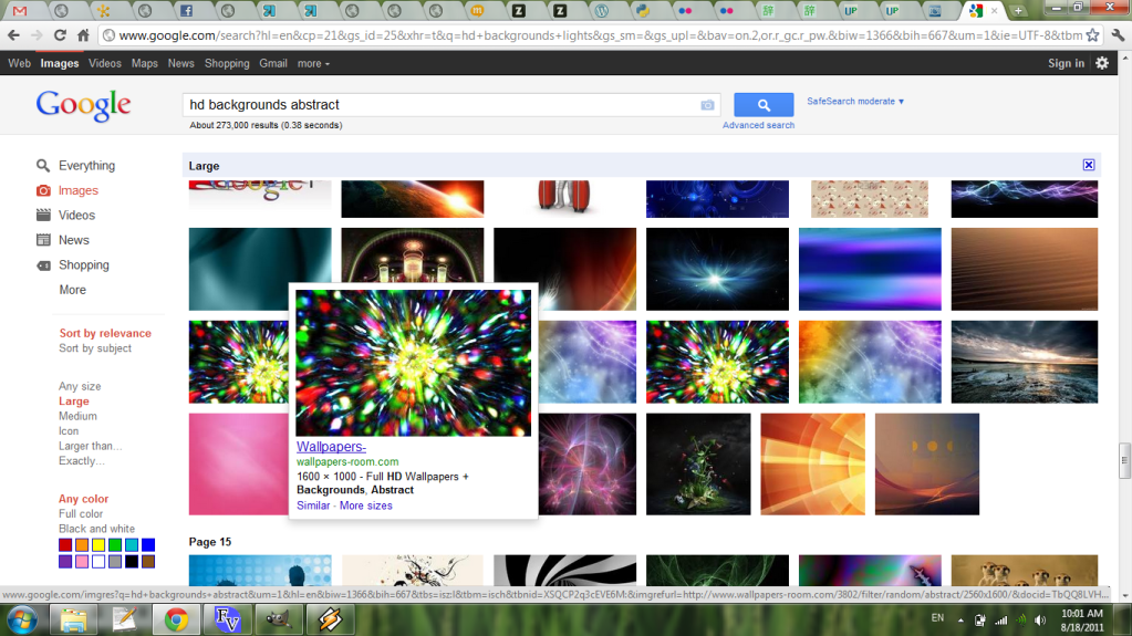
Flickr also allows you to search by Creative Commons-licensed content for adaptation if you swing that way. Make sure to get a high resolution - at least 800x600, bare minimum 640x480. This gives you room to crop or resize if you have to, while also allowing yourself room to make a BG out of it later if you so desire. Save this image in a work folder of your choice.
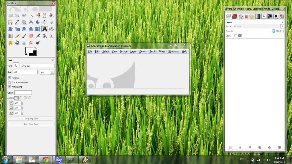
Step 3: Get some tabs.
GIMP has a lot of dockable dialogs that you'll probably find useful. My setup consists of:
* Layers
* Channels
* Paths
* Selection
* Undo
* Gradients
* Fonts
* Palettes
* Brushes
* Palette Editor
These can all be opened from the menu bar (Windows -> Dockable Dialogs). You can drag them into each other to create one multipurpose dialog.
You can now open your background image (File -> Open...) I've chosen this dark abstract for the tutorial banner.

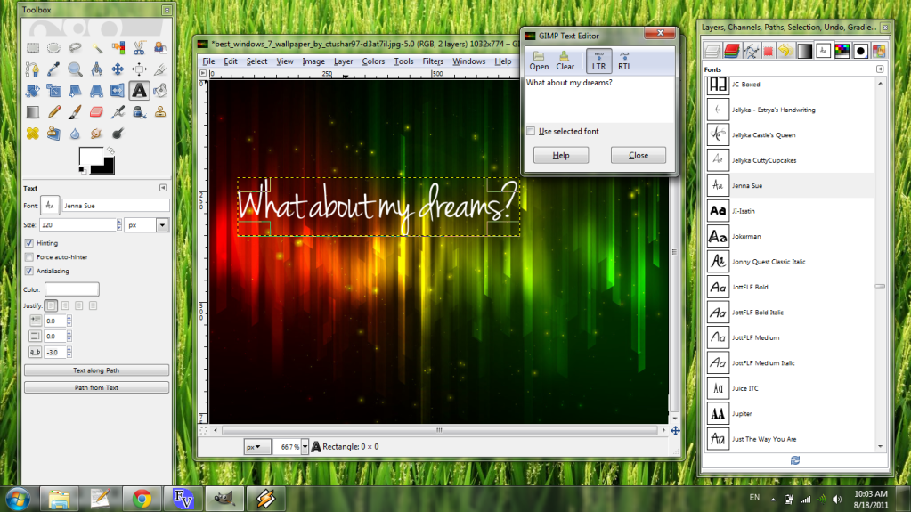
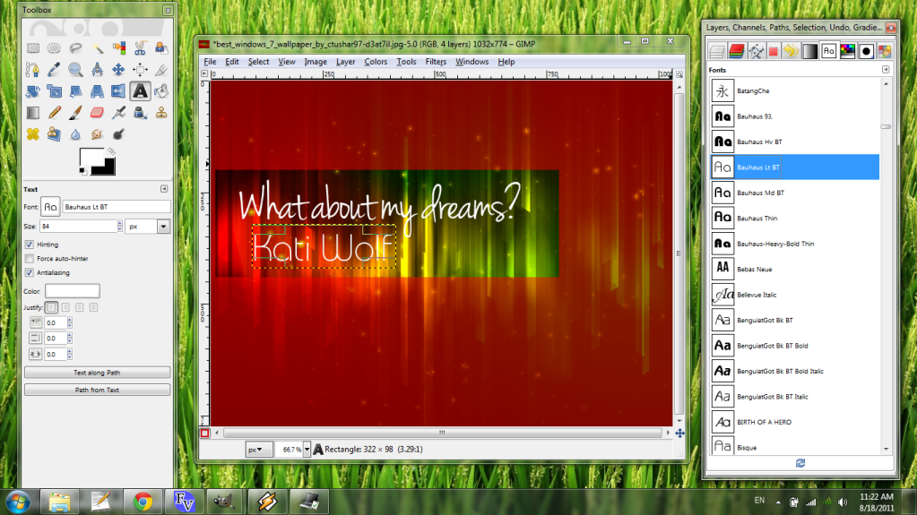
Step 4: Plan your font choice.
There are way too many fonts available from places like dafont. This thread is also worth checking. I like AMP Font Viewer for previewing what text will look like in fonts you've already installed (dafont also allows you to conveniently do this for fonts available there). If you download and install new fonts while you have GIMP open, you'll have to restart GIMP (the next startup will take a LONG TIME, but don't worry, it's still doing work).
Now that you have your background image opened, go left to the Toolbox, choose white as your foreground color, and select the Text tool (the bold 'A'). You can use the Fonts dialog to quickly navigate your font options. For this tutorial, I settled on Jenna Sue for the title of the song. When you're ready, click in the place you want to put your text and type away.
If you want to change the spacing between letters (I often do), the "a_b" category in the Text options on the Toolbox will do that for you. Here, I shrank the space by 3 pixels per letter pair.
If you're unhappy with the positioning of the text, you can move it by click-and-drag while still using the Text tool.
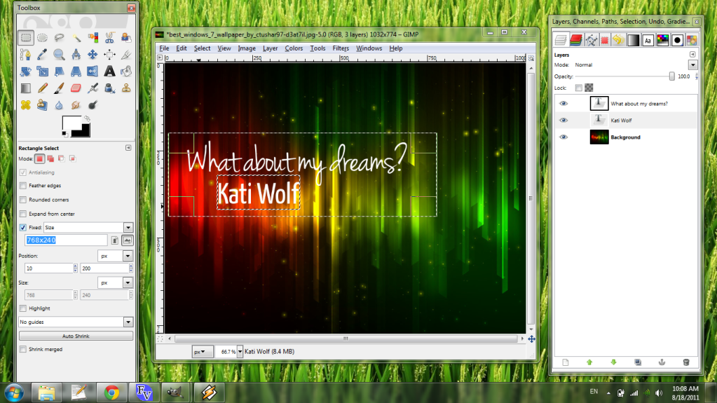
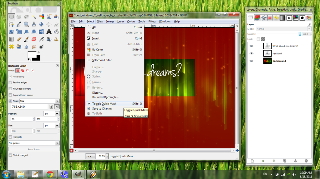
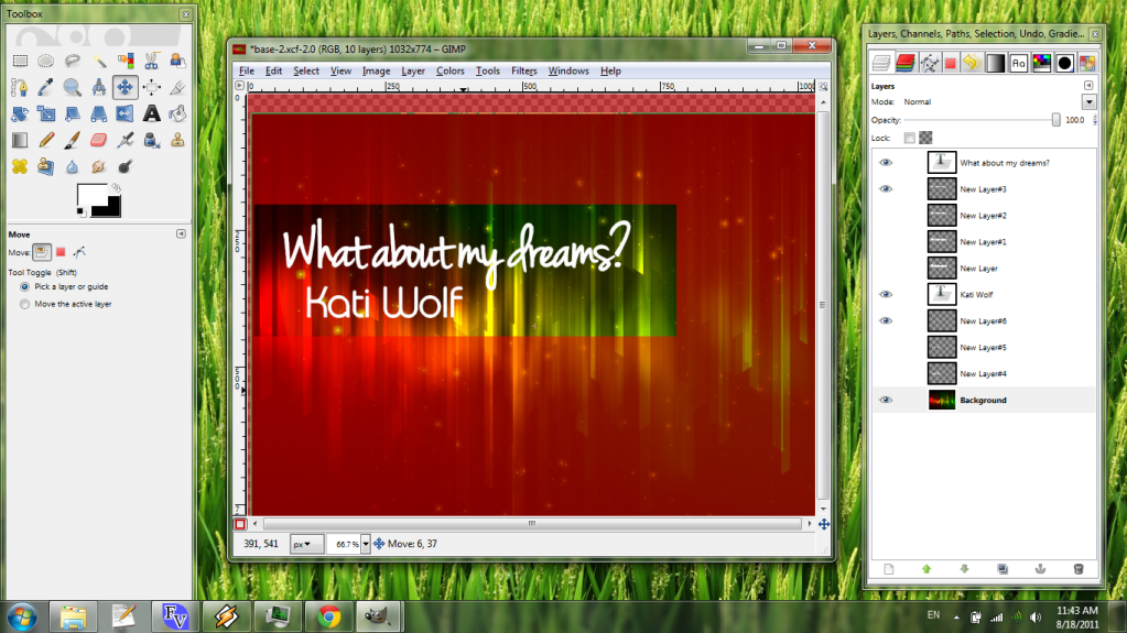
Step 5: Plan your banner area.
It's time to start thinking about the aspect ratio of your banner. The standard size for Stepmania banners is 256x80, but any multiple of that will be just fine, and other sizes too (418x164 is ITG standard, and I've seen 300x100 used before). I like to work with at least 512x160 (2x standard), so that themes with larger banner fields don't have to pixelate. Select the, um, Rectangle Select tool and choose a fixed size. I've picked 768x240 (3x standard) here. If you like, Aspect Ratio (with 256:80) works just as well.
Now that you've chosen your banner area, one more quick step before moving on: Quick Mask the area as shown in the next graphic (Select -> Toggle Quick Mask or Shift+Q). This tool is nice for easily sectioning off your workspace.
Step 6: Prepare for layering.
Paths are awkward to create in GIMP (I typically use Inkscape to vector things), but once you've got them they're pretty darn helpful. We're going to create some paths from our song title and artist text for later use. Head to the Layers tab on your dialog dock and right-click the text layer.

Choose "Text to Path". Repeat for each text layer.
(Right in the middle of this step, I decided I prefered Bauhaus Lt BT to Yanone Kaffeesatz lol)
Now, let's add some blank layers. At the bottom of the Layers tab is a "New Layer" icon.
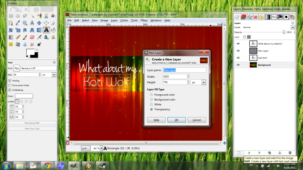
Make sure "Transparency" is selected and click OK. Do this a few times, then reorder your layers so that the title text is on top, the artist text is in the middle, and the background is at the bottom. Put at least three blank layers after the title text and two after the artist. (You can always add or remove them later.)
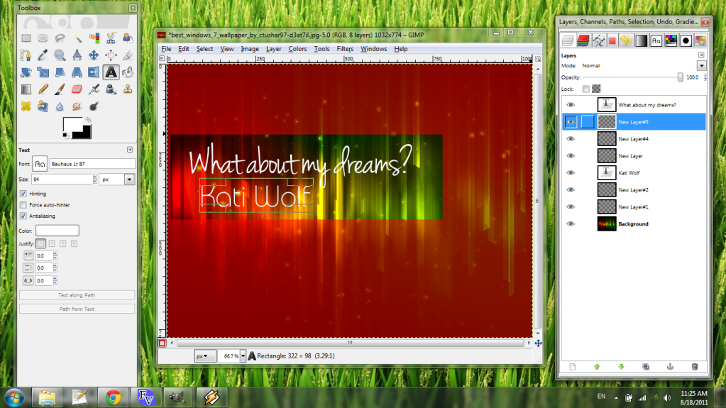
Step 7: Layer time!
Here's where things get interesting. Switch to the Paintbrush tool on the Toolbox and choose an ordinary sharp circular brush. (I used a 7px diameter here, but a 3px diameter in the final version.) Then select the first blank layer to work on.
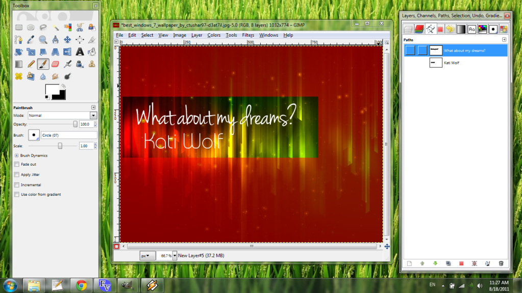
Now move to the Paths dialog and select the title text path, then click the little icon near the trash bin in the lower right, the icon that looks like a paintbrush painting a wiggly line.
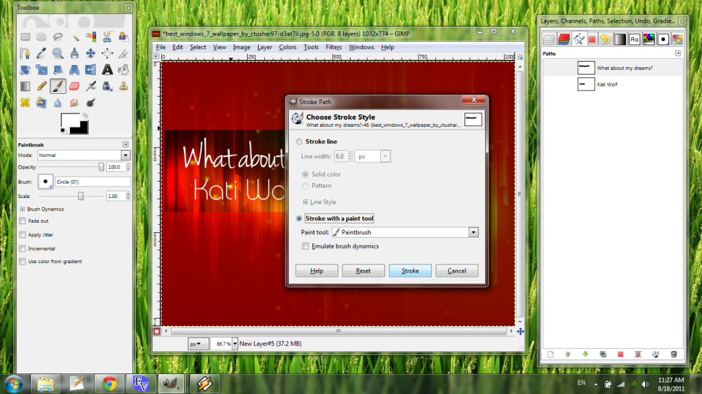
Make sure "Stroke with a paint tool" is selected. "Emulate brush dynamics" is fun to mess with, but we won't do that here ;) Then click "Stroke".
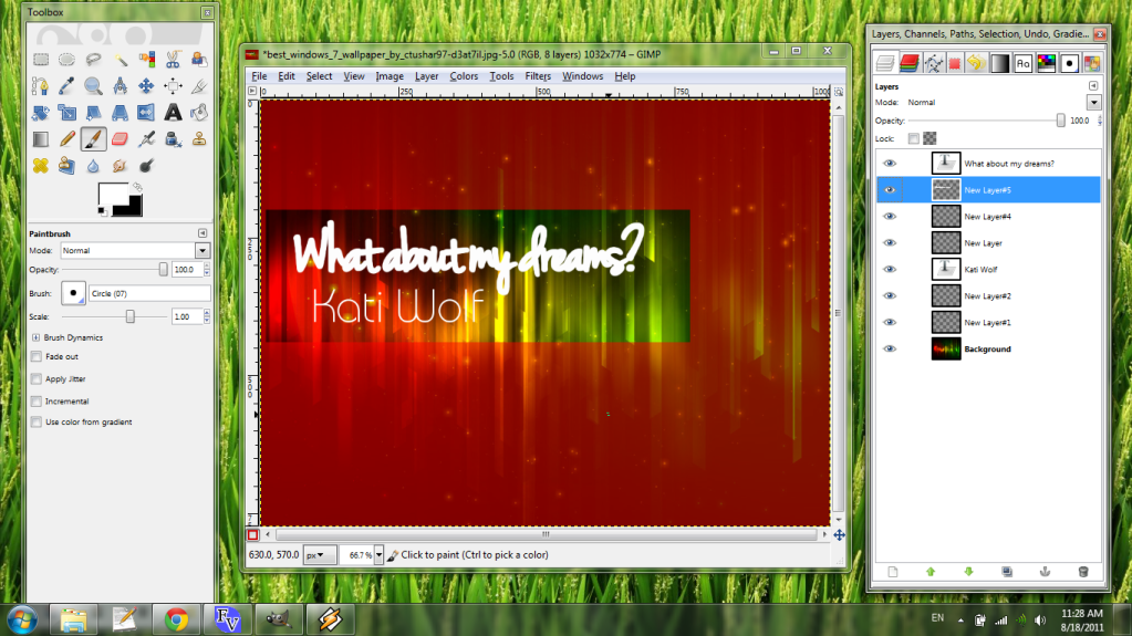
Repeat this with larger brush diameters and all text layers. (You can turn a layer's visibility off or on by clicking the eye next to a layer.)
Step 7b-ish: Tweak the background image
I relocated the background layer between Steps 7 and 8. If you want to do the same, select the Move tool and put the background where you want (keeping in mind how your banner area fits on it).
Then select the Background layer and choose Image -> Autocrop Image, a nice shortcut to readjust your image boundaries to the current layer.

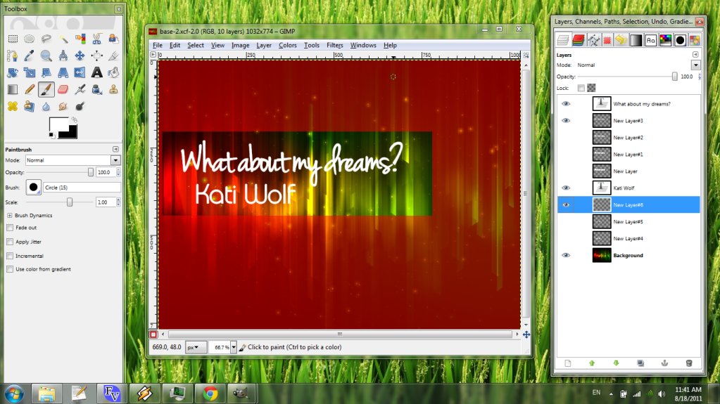
Step 8: Choose a color palette
You'll need some colors for your text now. You can choose whatever colors you like. If I don't have any specific plans, or I want something that looks good in not too much time, I like to choose colors from the background image. To do that, we'll use the Color Picker tool, which looks like an eyedropper.
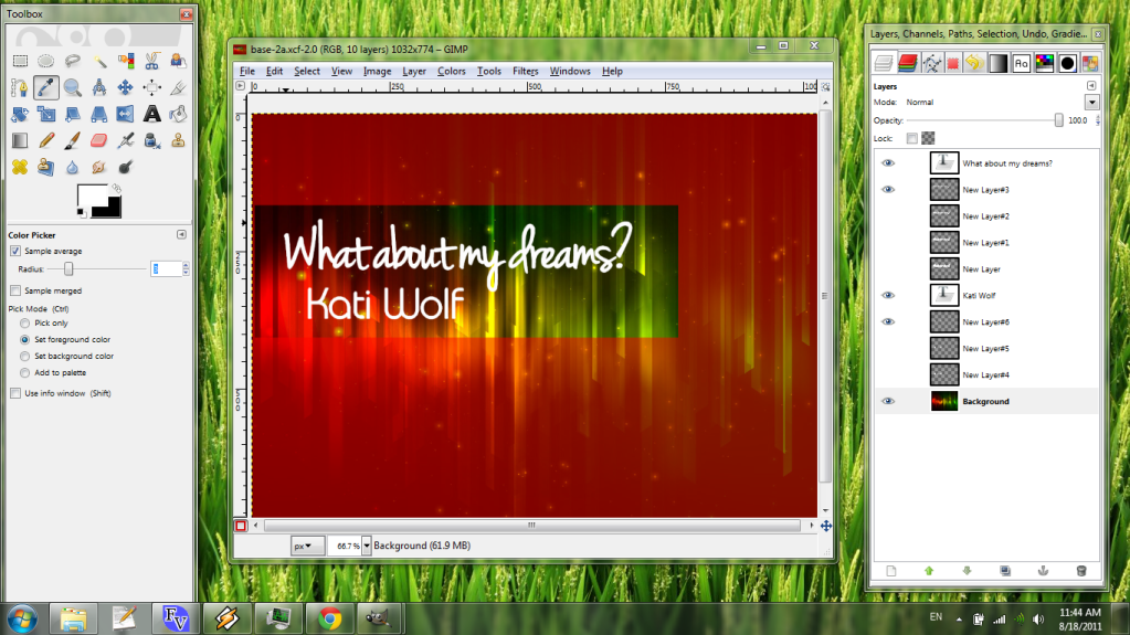
Now make sure your Background layer is selected (the color picker only selects from the current layer) and choose a color. You can use "Sample average" on the Toolbox to select the average of a group of pixels, or just choose one single pixel's color. Click the image to set the foreground color, and click the new foreground color on the Toolbox.
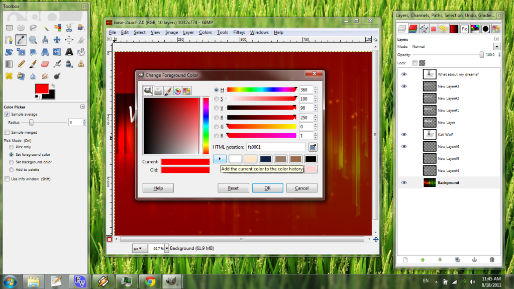
Add the color to your color history with the arrow button in the middle of the dialog. We'll use these colors in the next step:
Step 9: Gradients
Make a new transparent top layer and select two colors. Then open the Gradient tool on the Toolbox.
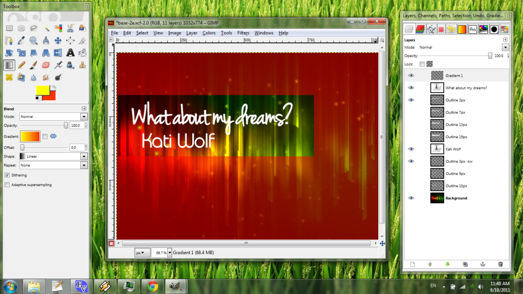
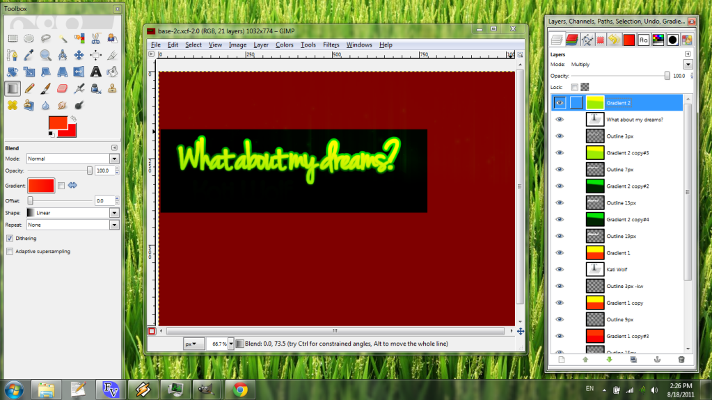
Now, before using the tool, we'll change the blending mode of the layer. The Layer dialog on the right includes a collection of blending modes that change how the current layer interacts with what's underneath it. In this case, set the mode to Multiply.
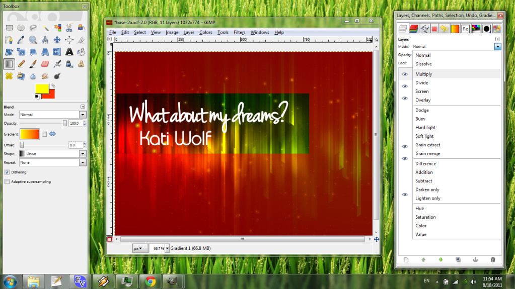
Nothing will happen until we actually place the gradient on the layer. Ensure the new transparent layer is selected. Then click on the image and hold to set the beginning point, drag to the end point, and release.
Notice how the rest of the image, not just the text, is now a shade more orange. The blended layer will appear to interact with everything underneath it, not just the next layer alone.
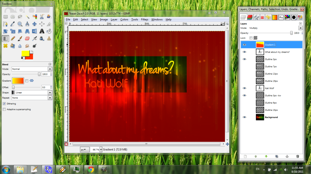
Let's make a whole bunch of gradients, both by using the "Create a duplicate of the layer" button at the bottom of the Layer dialog, and by repeating the first part of this step.
Step 10: Merge Down
It's a big step, what can I say? And the order you merge layers does matter when you're dealing with multiple blending functions. You can Merge Down a layer by right-clicking it and selecting Merge Down from the pop-up menu, or with Layer -> Merge Down from the main menu.
First, let's merge the text layers each with the 3px outlines we made in step 7. That leaves each gradient matching one layer of outline. Then merge each gradient with the layer below it.

Note that the image looks different each time you perform a Merge Down. Merging a layer with advanced blending onto one layer means that it no longer affects anything else but that single layer. This is normal
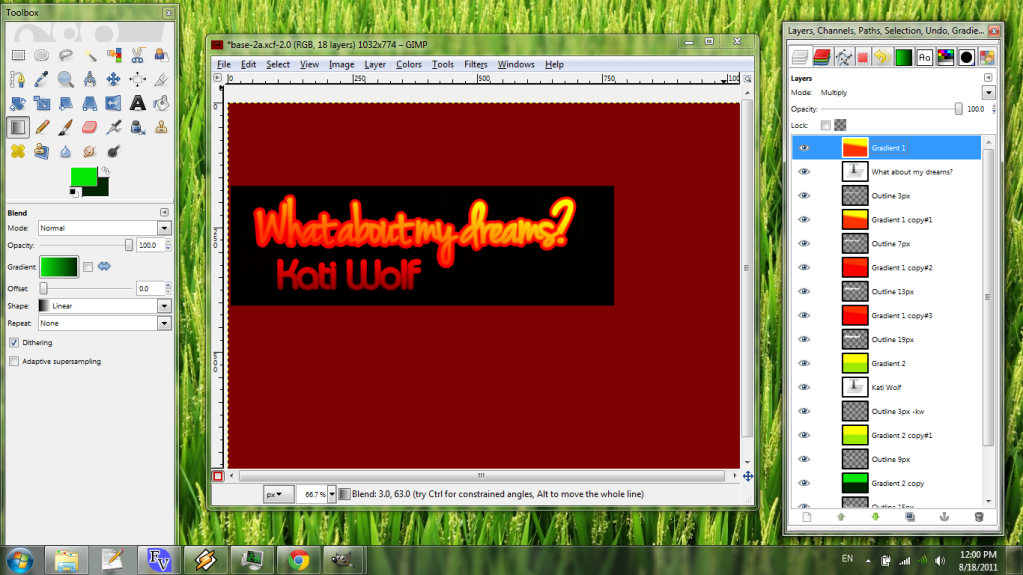
Step U: Let's Undo History!!
OK, so it looks like we're getting somewhere, but now that I've done all that, I think the green would go better on the title text. I'll use the undo history to easily get back to just before I merged in the gradients. Fortunately, we already docked that dialog:
Here you can see everything (up to a memory limit, usually 128MB or so IIRC) that you've done with your image, a small preview of what your image looked like after each action, and a short description of the action you took to get there. Let's back up to just before we applied all the gradients, then redo steps 9...
...and step 10 with the opposite color scheme.
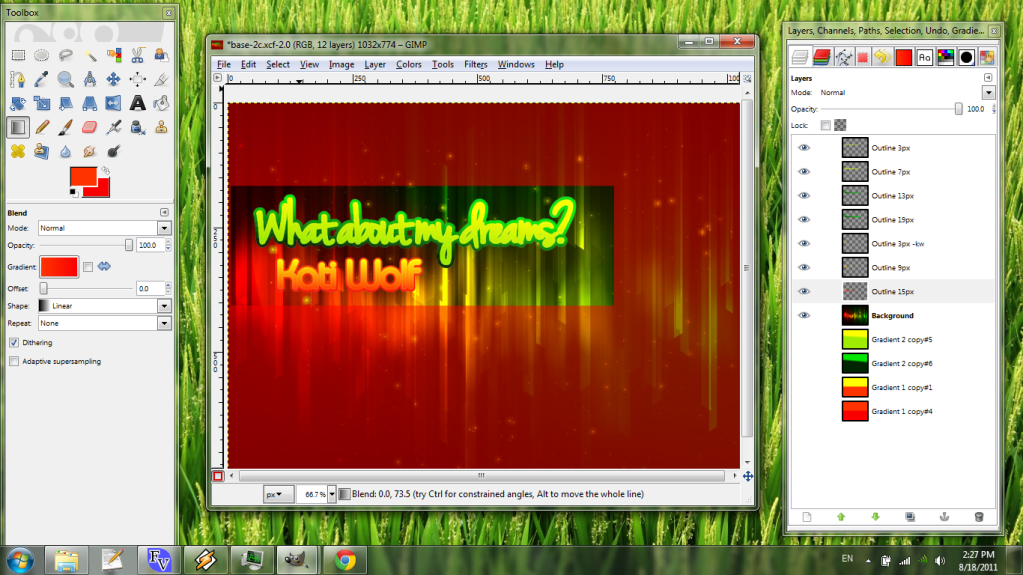
Step 11: More Blending Modes
Now we can start messing with blending modes. Some of my favorites are:
* "Normal" - the standard
* "Multiply" - always darkens, tends to look pretty flat
* "Hard/soft light" - depends on the color, tends to make colors vivid
* "Dodge/Burn" - lightens/darkens in some pretty cool ways, but can result in random ugly pixels of a very different color due to calculation issues
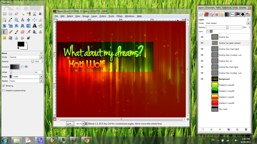
* "Grain extract/merge" - sometimes useful for unusual effects
This step is totally up to you, but I find that I like a dark inner outer outline on the title text most of the time, so I set the second-thinnest and thickest outlines to "Multiply" and the next-thickest to "Hard light".

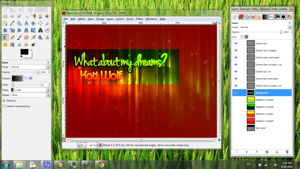
Step 12: Some optional minor tweaks
Using the alpha channel. You can introduce some cool transparency effects by taking one outline and cutting it out of a larger outline. Say we choose the 13px and 19px on the title text:

Right-click the 13px layer and click "Alpha to Selection". This is also in the Layer -> Transparency menu. Then, without doing anything else, click the 19px layer to make it current, and cut the selection out of it with Ctrl-X.
Opacity of layers. I didn't have to talk much about layer opacity in this tutorial, but you'll often find it useful to make outer layers less opaque for smoother blending. This is really easy to work with - just drag that slider under the layer blending mode box.
Drop Shadow. Don't overuse this! It can make banners tacky in a matter of seconds. If you want to make text pop just a little bit, though, select a suitable layer (here, the 13px outline on the title text) and navigate to Filters -> Light and Shadow -> Drop Shadow...
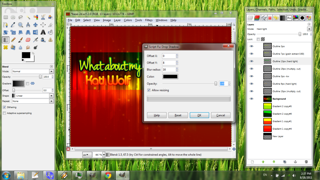
Most of the time, I prefer to use drop shadows that are directly downward. For that, make the "Offset X" zero, then choose an "Offset Y" that's somewhere between one-half and a full blur radius. An Offset Y of 8 and a blur radius of 15 or 16 is a good all-purpose default. Set the opacity to 100% - you can adjust that later manually, because the filter will create a new layer for you:
A good blending function for drop shadows is Burn. Unless this causes red pixels to appear randomly (which it does sometimes), I'd recommend it. Slide the Drop Shadow below all the text outline layers it corresponds to.
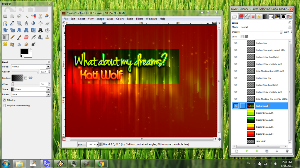
Step 13: oh my gawd we're almost done
When you're satisfied with your banner's looks, lock 'em in! Follow this short process. First, toggle Quick Mask back to a selection using Shift-Q or Select -> Toggle Quick Mask. Then go to Image -> Crop To Selection.
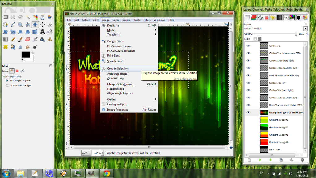
Next, flatten the image to one layer as-is, by navigating to Image -> Flatten Image.
Now you can scale the image to its proper size, if it's not already the right size, using Image -> Scale Image. Choose either "Cubic" or "Sinc (Lanczos3)" as the interpolation function for best results.
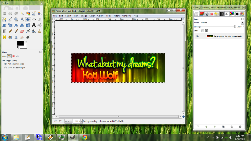
Step 14: Save!
The preferred format here and elsewhere is PNG, since the compression doesn't result in blocky images like JPEGs. Press Shift-Ctrl-S or navigate to File -> Save As... and either type ".png" at the end of your desired file name or select it as an extension below the entry field.

And you're done! You've made yourself a quality banner for your favorite song. You can now drop this PNG file into your song's folder in your Stepmania directory and most versions will pick it right up.
Please let me know here or by PM if anything's unclear or incorrect. Also remember that this is just a guide, and by all means I expect you to add your own personal touches to these steps. Make your own style!
Happy bannerizing!


Post #2 · Posted at 2011-08-20 07:44:58am 14.7 years ago
 TaroNuke TaroNuke | |
|---|---|
 |
Member+ |
| 1,170 Posts | |
 | |
| Reg. 2009-02-05 | |
 | |
| "ya did good, kiddo" | |
Beautiful!
If I could +5 you again, I would.
If I could +5 you again, I would.
Post #3 · Posted at 2011-08-20 07:48:31am 14.7 years ago
| Oni-91 | |
|---|---|
 |
Moderator+ |
| 13,525 Posts | |
| | |
| Reg. 2006-10-20 | |
  | |
| "Popular bisexual disaster" | |
Oh good, you got round to stepping What About My Dreams. 
Post #4 · Posted at 2011-08-20 07:49:36am 14.7 years ago
| Telperion | |
|---|---|
 |
Member+ |
| 2,005 Posts | |
 | |
| Reg. 2009-04-25 | |
| |
| "btor2osly" | |
Quote: Oni-91
Oh good, you got round to stepping What About My Dreams.
Not yet, actually - I only made the banner
Post #5 · Posted at 2011-08-20 10:17:04am 14.7 years ago
| Lord Toon | |
|---|---|
 |
Member |
| 1,616 Posts | |
| | |
| Reg. 2006-11-14 | |
 | |
| "lordtoon.com" | |
Great Tutorial Tel! But, you forgot the LAST STEP: When all else fails...PM Lord Toon or Silverdragon... //
//


Post #6 · Posted at 2011-08-20 10:46:30am 14.7 years ago
Wow great choice of song to do steps for!  I want to try to make a fan banner of Rockefeller Street, Boom Boom, Popular or Celebrate from Eurovision. Also might even step Moon Dance by Baklava (should had gone to Germany, but noooo) Great tutorial dude! Also you can try messing around with stuff and make some abstract backgrounds, I've done that before on Photoshop and got some nifty stuff before

Post #7 · Posted at 2011-08-20 05:22:20pm 14.7 years ago
| e-s-g | |
|---|---|
 |
Member |
| 2,207 Posts | |
| | |
| Reg. 2007-11-16 | |
i don't really agree with this - particularly the taking of a base image from the internet, hardly changing it (if at all) and slapping some fancy text on top of it.
your text work is really nice, i wouldn't be so irked if this tutorial was just for nice text, but as it is i can't say i would encourage this tutorial to others
your text work is really nice, i wouldn't be so irked if this tutorial was just for nice text, but as it is i can't say i would encourage this tutorial to others
Post #8 · Posted at 2011-08-20 09:37:54pm 14.7 years ago
Quote: e-s-g
i don't really agree with this - particularly the taking of a base image from the internet, hardly changing it (if at all) and slapping some fancy text on top of it.
your text work is really nice, i wouldn't be so irked if this tutorial was just for nice text, but as it is i can't say i would encourage this tutorial to others
your text work is really nice, i wouldn't be so irked if this tutorial was just for nice text, but as it is i can't say i would encourage this tutorial to others
The tutorial's meant to be more an intro to fancy text, anyhow
Post #9 · Posted at 2011-08-20 10:25:41pm 14.7 years ago
| AntoineRalic | |
|---|---|
 |
Banned |
| 112 Posts | |
| | |
| Reg. 2009-09-21 | |
I like this alot. And my ideal name for this should be called the Telperion Project if it was for the Internet, but NICE toutoral.
Post #10 · Posted at 2011-08-20 10:32:34pm 14.7 years ago
| Ali Uchiha | |
|---|---|
 |
Member |
| 540 Posts | |
 | |
| Reg. 2008-08-13 | |
| "お前をオカズにした事がある" | |
This is really nice Tel. Great job !


Post #11 · Posted at 2011-08-21 01:46:13am 14.7 years ago
| Blinded_No_More | |
|---|---|
 |
Member |
| 831 Posts | |
| | |
| Reg. 2011-02-19 | |
| "The eurobeat journeyman!" | |
I'm actually gonna try to learn this. I assume it works for backgrounds too?
Post #12 · Posted at 2011-08-21 01:57:53am 14.7 years ago
| AeronPeryton | |
|---|---|
 |
Member+ |
| 4,338 Posts | |
 | |
| Reg. 2007-03-03 | |
| "Give me a steady beat." | |
Quote: e-s-g
i don't really agree with this - particularly the taking of a base image from the internet, hardly changing it (if at all) and slapping some fancy text on top of it.
If you're worried about copyright implications you can take images from Creative Commons libraries such as FlickrCC.
Post #13 · Posted at 2011-08-21 05:01:23am 14.7 years ago
| e-s-g | |
|---|---|
|
Member |
| 2,207 Posts | |
| | |
| Reg. 2007-11-16 | |
i'm not worried about that, it's not like anyone will be making profit off of their banners. i just don't think it's a very effective way of making banners. it doesn't teach you anything about creating an image.
anyway...
anyway...
Post #14 · Posted at 2011-08-21 05:05:24am 14.7 years ago
| AeronPeryton | |
|---|---|
|
Member+ |
| 4,338 Posts | |
| | |
| Reg. 2007-03-03 | |
| "Give me a steady beat." | |
Last updated: 2011-08-21 05:06am
That's why this is a How to create a simfile banner tutorial. You should write one on making original graphics. 
Post #15 · Posted at 2011-08-25 11:12:09am 14.7 years ago
| Timer Rabbit | |
|---|---|
 |
Member |
| 469 Posts | |
| | |
| Reg. 2007-09-22 | |
| |
| "『))ゝ▽Ծ,,)" | |
It's a hit and miss, but then again I use the same method on finding a background stock. (Except of using HD backgrounds, I use HD-type artwork/stock and figure out matching cheep-pasta Photoshop text...
I like how you did the font though.
I like how you did the font though.

Post #16 · Posted at 2011-09-04 10:02:27am 14.7 years ago
| Mr.Music | |
|---|---|
 |
Member |
| 2,088 Posts | |
| | |
| Reg. 2010-08-28 | |
Sorry, but I have a question. How do you install the fonts into GIMP since the file format for the files I've gotten are .ttf files and GIMP uses .conf files?


Post #17 · Posted at 2011-09-12 08:25:23am 14.7 years ago
| Wan | |
|---|---|
 |
Member |
| 421 Posts | |
 | |
| Reg. 2008-01-13 | |
| "I want to change my username =(" | |
Last updated: 2011-09-12 08:25am
Quote: Mr.Music
Sorry, but I have a question. How do you install the fonts into GIMP since the file format for the files I've gotten are .ttf files and GIMP uses .conf files?
*facepalm*You install the fonts in your OS's Fonts folder (i.e. C:\Windows\Fonts in any Windows version).