
Post #1761 · Posted at 2013-05-03 10:34:32pm 13.1 years ago

I don't know why, But every time I listen to nightbird lost wing, it makes me feel sad. Agree or Disagree?
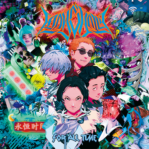
Jacket

Background

Banner

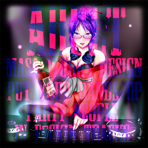
Jacket

Background

Banner

Post #1762 · Posted at 2013-05-03 11:20:39pm 13.1 years ago
 Silverhawke Silverhawke | |
|---|---|
 |
Member+ |
| 4,606 Posts | |
 | |
| Reg. 2009-01-27 | |
 | |
| "highwind fluffdragon" | |
Wait, I did something wrong so I fixed it a bit... and I'll just post the whole set:


Post #1763 · Posted at 2013-05-03 11:26:31pm 13.1 years ago
| Keyboarding | |
|---|---|
| Member | |
| 132 Posts | |
 | |
| Reg. 2012-03-20 | |
| "yes, the whole earth~" | |
Still looks really nice to me. What was the mistake, if you don't mind me asking?
Made almost completely from scratch (excluding the smiley image); too saccharine for everyone's tastes?


Made almost completely from scratch (excluding the smiley image); too saccharine for everyone's tastes?
 <-
<- 
Post #1764 · Posted at 2013-05-03 11:31:05pm 13.1 years ago
| Silverhawke | |
|---|---|
|
Member+ |
| 4,606 Posts | |
| | |
| Reg. 2009-01-27 | |
| |
| "highwind fluffdragon" | |
Quote: Keyboarding
Still looks really nice to me. What was the mistake, if you don't mind me asking?
Made almost completely from scratch (excluding the smiley image); too saccharine for everyone's tastes?
Made almost completely from scratch (excluding the smiley image); too saccharine for everyone's tastes?
I accidentally erased the Greek rings over them (it's supposed to be "circling" around them) and I added more. Changed the downscaling algorithm too :p
btw graphics from (almost) scratch is always nice, I like that. It's not too saccharine for me (at least it has a color scheme... not just rainbow puke :V)
Post #1765 · Posted at 2013-05-03 11:38:27pm 13.1 years ago
| Arrows&Beats | |
|---|---|
 |
Banned |
| 2,594 Posts | |
 | |
| Reg. 2011-08-13 | |
 | |
| "Witch hunt victim." | |
old. from january. forgotten??

☆ i just ☆
☆ i just ☆
Post #1766 · Posted at 2013-05-03 11:51:39pm 13.1 years ago
SoundFX09, you could use a much better choice of font, much better text placement, text effects such as stroke, gradients or drop shadow on the text, a larger font size, and a NOT pony background image, and it would be a lot better in my opinion...
Nightbird Lost Wing does seem a little sad, but I think that's the point of the song given the name.
A picture more relating to birds, or something more abstract would perhaps have been more relevant than a pony.
Nightbird Lost Wing does seem a little sad, but I think that's the point of the song given the name.
A picture more relating to birds, or something more abstract would perhaps have been more relevant than a pony.
Post #1767 · Posted at 2013-05-03 11:52:29pm 13.1 years ago
| Lord Toon | |
|---|---|
 |
Member |
| 1,616 Posts | |
| | |
| Reg. 2006-11-14 | |
  | |
| "lordtoon.com" | |
Quote: Silverhawke
Well let me clean up that shit up there with... these (thanks to Lord Toon, and forgive me for this)


I knew this would come back and bite me in the butt later on lol...//


Post #1768 · Posted at 2013-05-03 11:53:48pm 13.1 years ago
| TaroNuke | |
|---|---|
 |
Member+ |
| 1,170 Posts | |
 | |
| Reg. 2009-02-05 | |
 | |
| "ya did good, kiddo" | |
Is it bad that I actually think those look pretty cool, comic sans and all?
Post #1769 · Posted at 2013-05-03 11:55:48pm 13.1 years ago
| Silverhawke | |
|---|---|
|
Member+ |
| 4,606 Posts | |
| | |
| Reg. 2009-01-27 | |
| |
| "highwind fluffdragon" | |
btw I forgot about that, thanks everyone for that~ most of the work is with Toon though 
I find it funny though that some of you think that some of these look better than the original lol
I find it funny though that some of you think that some of these look better than the original lol
Post #1770 · Posted at 2013-05-03 11:56:25pm 13.1 years ago
| Lord Toon | |
|---|---|
|
Member |
| 1,616 Posts | |
| | |
| Reg. 2006-11-14 | |
| |
| "lordtoon.com" | |
Quote: TaroNuke
Is it bad that I actually think those look pretty cool, comic sans and all?
As a graphic hipster, I must protest! Well, as long as it's not in papyrus or impact.//Post #1771 · Posted at 2013-05-04 12:11:41am 13.1 years ago
| Keyboarding | |
|---|---|
| Member | |
| 132 Posts | |
| | |
| Reg. 2012-03-20 | |
| "yes, the whole earth~" | |
Well, I did say that V and Kiss Me All Night Long looked better than the originals 
Whipped this up just now:


Nothing too complicated; also a little experiment to see how fast I can make a pair of graphics without going overkill on it.
Whipped this up just now:
Nothing too complicated; also a little experiment to see how fast I can make a pair of graphics without going overkill on it.
Post #1772 · Posted at 2013-05-04 11:53:52am 13.1 years ago

That looks really nice, Keyboarding.
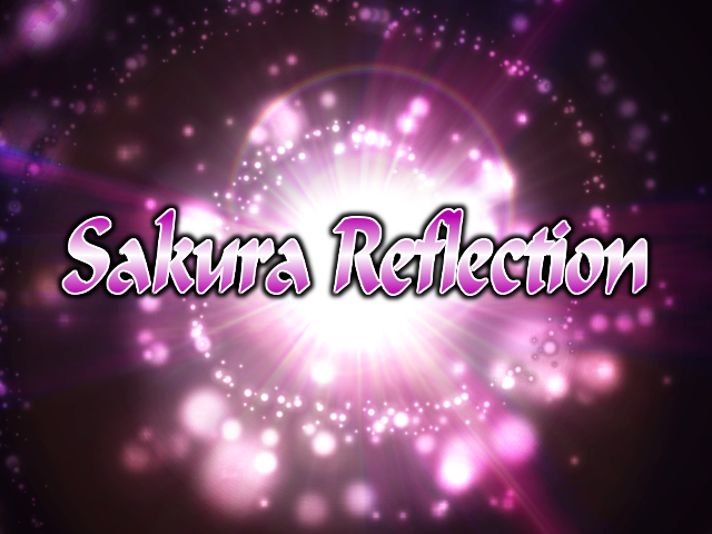
Here is a custom BG I made for Sakura Reflection.
Here's also a BG I created for New Decade (IIDX Edition).
-bg.png)
Here is a custom BG I made for Sakura Reflection.
Here's also a BG I created for New Decade (IIDX Edition).


Post #1773 · Posted at 2013-05-11 12:07:03pm 13 years ago
| Henry | |
|---|---|
 |
Member |
| 93 Posts | |
| Not Set | |
| Reg. 2013-01-21 | |


Post #1774 · Posted at 2013-05-11 10:00:17pm 13 years ago
| Keyboarding | |
|---|---|
| Member | |
| 132 Posts | |
| | |
| Reg. 2012-03-20 | |
| "yes, the whole earth~" | |
All of those look really nice; my favorites would have to be the Voltexes and the seiya-murai ones.
Because Dancemania SPEED...


Because Dancemania SPEED...
Post #1775 · Posted at 2013-05-12 11:09:56am 13 years ago
| ddrstepper | |
|---|---|
 |
Member |
| 443 Posts | |
| | |
| Reg. 2011-08-11 | |
| "representado en stepmaniax" | |
I'm trying to make a new CD Title for my files, and I'm trying to decide between these two:


I asked a couple of people on the chat and the vote is split so far, so I thought I'd post here to get more input.
I asked a couple of people on the chat and the vote is split so far, so I thought I'd post here to get more input.
Post #1776 · Posted at 2013-05-12 11:41:54am 13 years ago
| Henry | |
|---|---|
|
Member |
| 93 Posts | |
| Not Set | |
| Reg. 2013-01-21 | |
They both look pretty nice, but i'd go for the first one. It's more easier to read.
Post #1777 · Posted at 2013-05-12 08:23:57pm 13 years ago
| Keyboarding | |
|---|---|
| Member | |
| 132 Posts | |
| | |
| Reg. 2012-03-20 | |
| "yes, the whole earth~" | |
Definitely going with the first as well. The second one's not too bad, but if you darken the stroke or gradient fill, it'd be more readable.
Post #1778 · Posted at 2013-05-16 02:46:10pm 13 years ago
| Silverhawke | |
|---|---|
|
Member+ |
| 4,606 Posts | |
| | |
| Reg. 2009-01-27 | |
| |
| "highwind fluffdragon" | |
Last updated: 2013-05-16 02:47pm
Sold my soul to the Photoshop devil to recreate this


Post #1779 · Posted at 2013-05-16 07:03:34pm 13 years ago
| Keyboarding | |
|---|---|
| Member | |
| 132 Posts | |
| | |
| Reg. 2012-03-20 | |
| "yes, the whole earth~" | |
That looks amazing! I love the cursive text; was that handwritten or a font?
Because up until this pair, I hadn't considered using Inner Shadow on text more often.


Because up until this pair, I hadn't considered using Inner Shadow on text more often.
Post #1780 · Posted at 2013-05-16 10:42:49pm 13 years ago
| Silverhawke | |
|---|---|
|
Member+ |
| 4,606 Posts | |
| | |
| Reg. 2009-01-27 | |
| |
| "highwind fluffdragon" | |
Quote: Keyboarding
That looks amazing! I love the cursive text; was that handwritten or a font?
It was a handwriting that I vectorized. Does not recommend.