
Post #1241 · Posted at 2017-04-19 01:01:18pm 9.2 years ago
 Nicolas Nicolas | |
|---|---|
 |
Member |
| 1,516 Posts | |
 | |
| Reg. 2009-10-25 | |
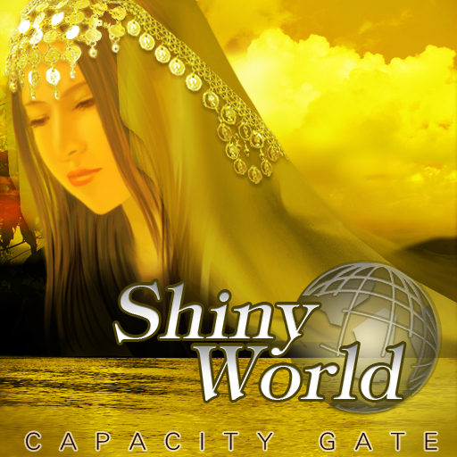
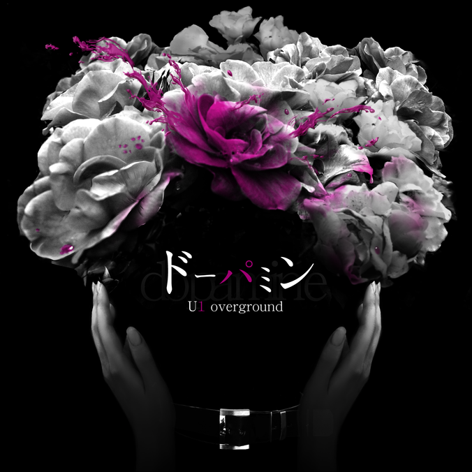
Does anybody know the font of Shiny World and Dopamine (title and artist)?

![https://zenius-i-vanisher.com/pictures/4888-1490970355[0].png](https://zenius-i-vanisher.com/pictures/4888-1490970355[0].png)
Post #1242 · Posted at 2017-04-19 01:23:07pm 9.2 years ago
| DevilsLynAvenged12! | |
|---|---|
 |
Member |
| 427 Posts | |
 | |
| Reg. 2016-11-26 | |
For the Shiny World Title: Clearface Serial Bold Italic
Core Sans G Outline Regular(I believe so for the Capacity Gate artist)
I have no clue for the Dopamine
Core Sans G Outline Regular(I believe so for the Capacity Gate artist)
I have no clue for the Dopamine
Post #1243 · Posted at 2017-04-19 01:32:17pm 9.2 years ago
| Nicolas | |
|---|---|
|
Member |
| 1,516 Posts | |
| | |
| Reg. 2009-10-25 | |
They look different to me:
Clearface Serial Bold Italic:

Core Sans G Outline Regular:

Clearface Serial Bold Italic:
Core Sans G Outline Regular:
Post #1244 · Posted at 2017-04-19 01:50:25pm 9.2 years ago
| Oni-91 | |
|---|---|
 |
Moderator+ |
| 13,526 Posts | |
 | |
| Reg. 2006-10-20 | |
  | |
| "Popular bisexual disaster" | |
Capacity Gate is Proxima Nova.

Post #1245 · Posted at 2017-04-19 01:52:01pm 9.2 years ago
| DevilsLynAvenged12! | |
|---|---|
|
Member |
| 427 Posts | |
| | |
| Reg. 2016-11-26 | |
Shiny World Title is actually Tipton
Post #1246 · Posted at 2017-04-19 01:56:58pm 9.2 years ago
| Oni-91 | |
|---|---|
|
Moderator+ |
| 13,526 Posts | |
| | |
| Reg. 2006-10-20 | |
| |
| "Popular bisexual disaster" | |
It's a weird one that the font style is Tipton/Tiffany Regular, though the display is in Italic. Tiffany Italic has changes to certain letters like the y.
Post #1247 · Posted at 2017-04-19 02:36:27pm 9.2 years ago
| Nicolas | |
|---|---|
|
Member |
| 1,516 Posts | |
| | |
| Reg. 2009-10-25 | |
Yeah, Shiny World's title 'is' definitely Tiffany Regular.
I'm guessing that it's faux italicized since it's regular-italic version looks very different.
For CAPACITY GATE, Proxima Nova's very close with the exception of its "C" and "G".
I'll still take it, though
Thank you so much for your help, guys!
Also, I'm guessing that the font for Dopamine's not in the font pack
Post #1248 · Posted at 2017-04-19 02:58:49pm 9.2 years ago
| Oni-91 | |
|---|---|
|
Moderator+ |
| 13,526 Posts | |
| | |
| Reg. 2006-10-20 | |
| |
| "Popular bisexual disaster" | |
Last updated: 2017-04-19 03:00pm
Ooh, is the G not right? Give something like Univers a try. Zurich if you want to find a cheap alternate.
Post #1249 · Posted at 2017-05-02 09:24:02am 9.1 years ago
That's a much closer "C" and "G". Thank you so much
append:
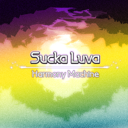
Does anybody know the font for Sucka Luva?
append:
Does anybody know the font for Sucka Luva?
Post #1250 · Posted at 2017-05-02 12:18:45pm 9.1 years ago
| DevilsLynAvenged12! | |
|---|---|
|
Member |
| 427 Posts | |
| | |
| Reg. 2016-11-26 | |
Alright the font is LaPerutaFLF for Sucka Luva
Post #1251 · Posted at 2017-05-03 03:11:26am 9.1 years ago
| Nicolas | |
|---|---|
|
Member |
| 1,516 Posts | |
| | |
| Reg. 2009-10-25 | |
Exactly what I was looking for. Thank you!
Post #1252 · Posted at 2017-05-03 03:25:24am 9.1 years ago
| DevilsLynAvenged12! | |
|---|---|
|
Member |
| 427 Posts | |
| | |
| Reg. 2016-11-26 | |
No Problem. I'm always here to help 
Post #1253 · Posted at 2017-05-10 02:24:27pm 9.1 years ago
| Nicolas | |
|---|---|
|
Member |
| 1,516 Posts | |
| | |
| Reg. 2009-10-25 | |
Does anybody know what Anti-Matter's font is (both title and the artist)?
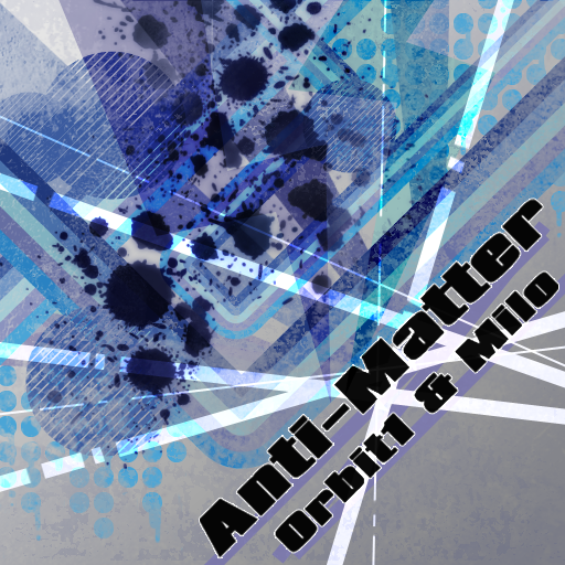

I'm mainly basing on the ampersand, and the lowercase "R", and it's not Impact (or at least, the Impact font that I have installed)
Btw, I asked SOUND HOLIC over at Twitter about this and they replied! (omgomg )
)
The font is Baloney
.I'm mainly basing on the ampersand, and the lowercase "R", and it's not Impact (or at least, the Impact font that I have installed)
Quote: Nicolas
KURENAI's font?

Btw, I asked SOUND HOLIC over at Twitter about this and they replied! (omgomg
The font is Baloney
Post #1254 · Posted at 2017-05-10 02:38:13pm 9.1 years ago
| Oni-91 | |
|---|---|
|
Moderator+ |
| 13,526 Posts | |
| | |
| Reg. 2006-10-20 | |
| |
| "Popular bisexual disaster" | |
Anti-Matter looks like Compacta Black.Looks to be extended horizontally too.
Post #1255 · Posted at 2017-05-10 03:42:57pm 9.1 years ago
| Nicolas | |
|---|---|
|
Member |
| 1,516 Posts | |
| | |
| Reg. 2009-10-25 | |
^ Once again, thank you so much!
Post #1256 · Posted at 2017-05-11 11:14:08pm 9.1 years ago
| DevilsLynAvenged12! | |
|---|---|
|
Member |
| 427 Posts | |
| | |
| Reg. 2016-11-26 | |

I'm having a rough time trying to figure out what this font is. Can someone help me figure it out?
Post #1257 · Posted at 2017-05-22 12:53:44pm 9.1 years ago
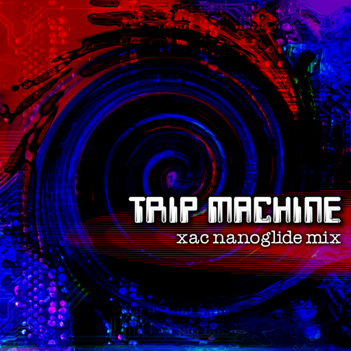
Does anybody know the font for the subtitle of TRIP MACHINE (xac nanoglide mix)?
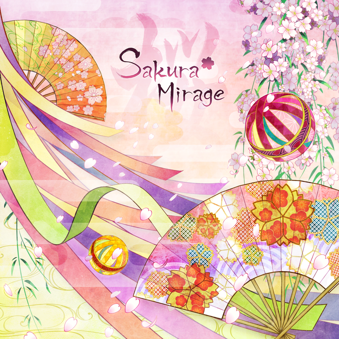
Also, for Sakura Mirage [title and the Sakura (桜) character]?
Also, for Sakura Mirage [title and the Sakura (桜) character]?
Post #1258 · Posted at 2017-05-22 01:54:44pm 9.1 years ago
| DevilsLynAvenged12! | |
|---|---|
|
Member |
| 427 Posts | |
| | |
| Reg. 2016-11-26 | |
I believe that the font for the subtitle of Trip Machine looks like Typewriter FS
and I don't know the second one
and I don't know the second one
Post #1259 · Posted at 2017-05-26 12:02:38pm 9.1 years ago
| Nicolas | |
|---|---|
|
Member |
| 1,516 Posts | |
| | |
| Reg. 2009-10-25 | |
^ The subtitle is Typewriter, thank you
![https://zenius-i-vanisher.com/pictures/4888-1495799736[0].png](https://zenius-i-vanisher.com/pictures/4888-1495799736[0].png)
So apparently, BALLAD THE FEATHER's title font is a vertically-squished version of this
![https://zenius-i-vanisher.com/pictures/4888-1495799864[0].png](https://zenius-i-vanisher.com/pictures/4888-1495799864[0].png)
Quote: Nicolas
Anybody knows what BALLAD THE FEATHER's title font is?
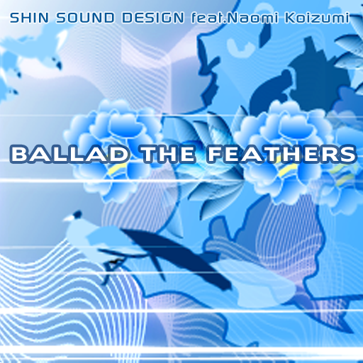

So apparently, BALLAD THE FEATHER's title font is a vertically-squished version of this
Post #1260 · Posted at 2017-05-26 12:29:23pm 9.1 years ago
| Oni-91 | |
|---|---|
|
Moderator+ |
| 13,526 Posts | |
| | |
| Reg. 2006-10-20 | |
| |
| "Popular bisexual disaster" | |
Right, I THINK it's Angro Bold. But don't quote me on that.