
Post #101 · Posted at 2024-05-19 06:22:22pm 2 years ago
 n00b_saib0t n00b_saib0t | |
|---|---|
 |
Member |
| 2,455 Posts | |
 | |
| Reg. 2007-02-05 | |
   | |
| "F***ing exhausted." | |
Last updated: 2024-05-19 10:14pm
Quote: hollandaze
Quote: DJjeff2010
Despite all this, let's all keep in mind that these are just mock-ups and will probably not completely reflect what the final look will be, and are also taking feedback from players to improve it before release. That's what I'm hoping at least.
I admire your optimism but when has Konami ever proved us that they make smart decisions that make fans happy
DDR A3 when players weren’t happy that background judgment was locked behind a paywall so they made it free
DDR World when players weren’t happy that options like the filter were on the website so they made it an option in the game
I mean I get it, it’s Konami, but it’s not entirely bad decisions here.
Post #102 · Posted at 2024-05-19 10:02:27pm 2 years ago
| DJjeff2010 | |
|---|---|
 |
Member |
| 646 Posts | |
| | |
| Reg. 2010-06-09 | |
| "PLACE YOUR BET!!" | |
Quote: n00b_saib0t
Quote: hollandaze
Quote: DJjeff2010
Despite all this, let's all keep in mind that these are just mock-ups and will probably not completely reflect what the final look will be, and are also taking feedback from players to improve it before release. That's what I'm hoping at least.
I admire your optimism but when has Konami ever proved us that they make smart decisions that make fans happy
DDR A3 when players weren’t happy that background judgment was locked behind a paywall so they made it free
DDR World when players weren’t happy that options like the filer were on the website so they made it an option in the game
I mean I get it, it’s Konami, but it’s not entirely bad decisions here.
See what I mean? Right there, there ya go! I agree it's not all bad, and they do take feedback and make changes when needed if enough make a stink about it, and I think the same will apply here.
Post #103 · Posted at 2024-05-19 11:23:37pm 2 years ago
| eataninja | |
|---|---|
 |
Member |
| 818 Posts | |
| | |
| Reg. 2011-05-05 | |
I don't understand why we would be shown mockups instead of actual game screenshots when the UI is likely a month out from release. I'm guessing the game looks exactly like this.
I also don't think it's all bad, but it's extremely visually cluttered and I personally find the UI very difficult to look at. There's a lot of stuff all over the place without clear borders, or any real distinction in brightness between the song selection scroll and the background. The whole interface is difficult to parse and doesn't feel very user-friendly.
I also don't think it's all bad, but it's extremely visually cluttered and I personally find the UI very difficult to look at. There's a lot of stuff all over the place without clear borders, or any real distinction in brightness between the song selection scroll and the background. The whole interface is difficult to parse and doesn't feel very user-friendly.
Post #104 · Posted at 2024-05-20 12:10:11am 2 years ago
| finalfan2cwiz | |
|---|---|
 |
Member+ |
| 968 Posts | |
| | |
| Reg. 2007-12-29 | |
  | |
The lack of dancers or really anything going on in the background just absolutely kills this mix for me. I hope these are truly just mockups with a lot of improvement coming!
Post #105 · Posted at 2024-05-20 02:33:32am 2 years ago
| makoflagkk | |
|---|---|
 |
Member |
| 103 Posts | |
| | |
| Reg. 2023-03-12 | |
I hope this mix removes announcers or at least don’t have them during the song. Since the first game I never understood why you would need a voice repeating the same lines over and over again when you are trying to listen to a song. I prefer clean audio like ITG or any other rhythm game This game seems the biggest change since the transition from EXTREME to SuperNOVA . I honestly can get used to it after a while. I would just fix the small bg videos. It’s cool that you can select options again to change the filter without having an account. Ever since 2014 DDR.
Post #106 · Posted at 2024-05-20 05:00:20am 2 years ago
| DBHxgiga92 | |
|---|---|
 |
Member |
| 1,760 Posts | |
| | |
| Reg. 2008-07-11 | |
| "Revolution" | |
There's quite a buzz about the upcoming WORLD, isn't there? Having looked at the previews, I have plenty to say:
I like that finally there will be the ability to see the BPM (and its changes) during the song.
I like that the Hou effect has a name and will be available for any song.
I'm fine with the color scheme. It kinda reminds me of 2013-2014, but fizzy lime soda. It also doesn't seem static as the background is different among screenshots.
I like the full showing of what the keypad does. I routinely forget I can use it for anything after logging in with my e-amuse, despite it being on the side to tell me what they do one digit at a time.
I like the idea of the "gimmick" symbols, but it also seems unnecessary for the "speed change" icon to be there when I can see by the BPM that it's gonna have speed changes. Maybe it makes sense for songs like Unreality and Dance Phenomena (despite the latter being credited with actual BPM changes), but it seems like repetitive information on the screen.
Speaking of, I like the idea of having song jacket backgrounds match your Flare Clear, but why also have the small Flare Clear indicator as we have in A3? Pick one or the other, please.
Also, can we space out the song jackets, even just a little? I like the background, but the song wheel doesn't have to be squeezed in that much. (Ironically I thought if you folded in the sides of the screen where Emi and Rage are, you could maybe have a decent theme forULTIMATE MOBILE a mobile version.)
Why is there a space between "Difficulty" and "Level | Best Score | Clear Rank"?
After reading comments regarding Groove Radar, I realize I've never considered it in terms of being a helpful guide. I would still want it, but maybe its purpose also needs upgrading.
I'm curious how well the options selected translate into those squares on the sides of the gameplay screen, not to mention what the background will do when there is no video. For all we know, Emi and Rage aren't the only new makeovers, but they can't show why just yet.
Most importantly, was BREAKING THE FUTURE maxing out at 361 BPM this whole time?
I hold these previews as concept art until I see them in action, and I don't think it's set in stone that this is exactly what WORLD will be. I hope there will be at least one location test as DDR hasn't had one of those in years, and for this big of a change, it certainly can use it. This could alleviate worries, and as stated earlier, they are seemingly listening to feedback and acting accordingly so let's see what happens.
I like that finally there will be the ability to see the BPM (and its changes) during the song.
I like that the Hou effect has a name and will be available for any song.
I'm fine with the color scheme. It kinda reminds me of 2013-2014, but fizzy lime soda. It also doesn't seem static as the background is different among screenshots.
I like the full showing of what the keypad does. I routinely forget I can use it for anything after logging in with my e-amuse, despite it being on the side to tell me what they do one digit at a time.
I like the idea of the "gimmick" symbols, but it also seems unnecessary for the "speed change" icon to be there when I can see by the BPM that it's gonna have speed changes. Maybe it makes sense for songs like Unreality and Dance Phenomena (despite the latter being credited with actual BPM changes), but it seems like repetitive information on the screen.
Speaking of, I like the idea of having song jacket backgrounds match your Flare Clear, but why also have the small Flare Clear indicator as we have in A3? Pick one or the other, please.
Also, can we space out the song jackets, even just a little? I like the background, but the song wheel doesn't have to be squeezed in that much. (Ironically I thought if you folded in the sides of the screen where Emi and Rage are, you could maybe have a decent theme for
Why is there a space between "Difficulty" and "Level | Best Score | Clear Rank"?
After reading comments regarding Groove Radar, I realize I've never considered it in terms of being a helpful guide. I would still want it, but maybe its purpose also needs upgrading.
I'm curious how well the options selected translate into those squares on the sides of the gameplay screen, not to mention what the background will do when there is no video. For all we know, Emi and Rage aren't the only new makeovers, but they can't show why just yet.
Most importantly, was BREAKING THE FUTURE maxing out at 361 BPM this whole time?
I hold these previews as concept art until I see them in action, and I don't think it's set in stone that this is exactly what WORLD will be. I hope there will be at least one location test as DDR hasn't had one of those in years, and for this big of a change, it certainly can use it. This could alleviate worries, and as stated earlier, they are seemingly listening to feedback and acting accordingly so let's see what happens.

Post #107 · Posted at 2024-05-20 08:24:48am 2 years ago

Quote: AxelWasHere
I made the UI better with my version here you go.
> inserts Ace songwheel
> inserts Ace songwheel
LOL no
Quote: eataninja
I don't understand why we would be shown mockups instead of actual game screenshots when the UI is likely a month out from release. I'm guessing the game looks exactly like this.
this ^, Ace had beta screenshots on the website and barely looks any different from release

Post #108 · Posted at 2024-05-20 12:20:55pm 2 years ago
| SpyHunter29 | |
|---|---|
 |
Member |
| 371 Posts | |
| | |
| Reg. 2008-06-09 | |
Quote: DBHxgiga92
There's quite a buzz about the upcoming WORLD, isn't there? Having looked at the previews, I have plenty to say:
I like that finally there will be the ability to see the BPM (and its changes) during the song.
I like that the Hou effect has a name and will be available for any song.
I'm fine with the color scheme. It kinda reminds me of 2013-2014, but fizzy lime soda. It also doesn't seem static as the background is different among screenshots.
I like the full showing of what the keypad does. I routinely forget I can use it for anything after logging in with my e-amuse, despite it being on the side to tell me what they do one digit at a time.
I like the idea of the "gimmick" symbols, but it also seems unnecessary for the "speed change" icon to be there when I can see by the BPM that it's gonna have speed changes. Maybe it makes sense for songs like Unreality and Dance Phenomena (despite the latter being credited with actual BPM changes), but it seems like repetitive information on the screen.
Speaking of, I like the idea of having song jacket backgrounds match your Flare Clear, but why also have the small Flare Clear indicator as we have in A3? Pick one or the other, please.
Also, can we space out the song jackets, even just a little? I like the background, but the song wheel doesn't have to be squeezed in that much. (Ironically I thought if you folded in the sides of the screen where Emi and Rage are, you could maybe have a decent theme forULTIMATE MOBILE a mobile version.)
Why is there a space between "Difficulty" and "Level | Best Score | Clear Rank"?
After reading comments regarding Groove Radar, I realize I've never considered it in terms of being a helpful guide. I would still want it, but maybe its purpose also needs upgrading.
I'm curious how well the options selected translate into those squares on the sides of the gameplay screen, not to mention what the background will do when there is no video. For all we know, Emi and Rage aren't the only new makeovers, but they can't show why just yet.
Most importantly, was BREAKING THE FUTURE maxing out at 361 BPM this whole time?
I hold these previews as concept art until I see them in action, and I don't think it's set in stone that this is exactly what WORLD will be. I hope there will be at least one location test as DDR hasn't had one of those in years, and for this big of a change, it certainly can use it. This could alleviate worries, and as stated earlier, they are seemingly listening to feedback and acting accordingly so let's see what happens.
I like that finally there will be the ability to see the BPM (and its changes) during the song.
I like that the Hou effect has a name and will be available for any song.
I'm fine with the color scheme. It kinda reminds me of 2013-2014, but fizzy lime soda. It also doesn't seem static as the background is different among screenshots.
I like the full showing of what the keypad does. I routinely forget I can use it for anything after logging in with my e-amuse, despite it being on the side to tell me what they do one digit at a time.
I like the idea of the "gimmick" symbols, but it also seems unnecessary for the "speed change" icon to be there when I can see by the BPM that it's gonna have speed changes. Maybe it makes sense for songs like Unreality and Dance Phenomena (despite the latter being credited with actual BPM changes), but it seems like repetitive information on the screen.
Speaking of, I like the idea of having song jacket backgrounds match your Flare Clear, but why also have the small Flare Clear indicator as we have in A3? Pick one or the other, please.
Also, can we space out the song jackets, even just a little? I like the background, but the song wheel doesn't have to be squeezed in that much. (Ironically I thought if you folded in the sides of the screen where Emi and Rage are, you could maybe have a decent theme for
Why is there a space between "Difficulty" and "Level | Best Score | Clear Rank"?
After reading comments regarding Groove Radar, I realize I've never considered it in terms of being a helpful guide. I would still want it, but maybe its purpose also needs upgrading.
I'm curious how well the options selected translate into those squares on the sides of the gameplay screen, not to mention what the background will do when there is no video. For all we know, Emi and Rage aren't the only new makeovers, but they can't show why just yet.
Most importantly, was BREAKING THE FUTURE maxing out at 361 BPM this whole time?
I hold these previews as concept art until I see them in action, and I don't think it's set in stone that this is exactly what WORLD will be. I hope there will be at least one location test as DDR hasn't had one of those in years, and for this big of a change, it certainly can use it. This could alleviate worries, and as stated earlier, they are seemingly listening to feedback and acting accordingly so let's see what happens.
THIS. It's about time we had some serious, objective analysis on the matter. Thank you. In other news,

I just noticed that the difficulty names on the left-hand list extend past their text box, and the ratings beside them are horizontally uneven as a result. It's probably going to get fixed soon, but... [knock on wood]
Post #109 · Posted at 2024-05-20 04:18:20pm 2 years ago
| SocialDragon322 | |
|---|---|
| Member | |
| 327 Posts | |
 | |
| Reg. 2019-09-13 | |
Even if a location test happens, it may see a June 2024 Release date in Japan, and a 2025 release date worldwide.
Post #110 · Posted at 2024-05-20 07:12:28pm 2 years ago
| Hlavco | |
|---|---|
 |
Member |
| 128 Posts | |
| | |
| Reg. 2009-06-02 | |
I kinda figured the uneven text alignment in the difficulty box was part of a "sloppy" aesthetic they're going for, like how the timer in the upper right uses two different font colors. But yeah, it could just be that they changed the difficulty font at the last minute and haven't adjusted the rest of the box accordingly.
Out of all the criticisms on here, I most strongly agree with the opinion that the song covers should be spaced out a bit more. Though it probably looks a bit better on a new save file where there aren't different Flare colors all over the place.
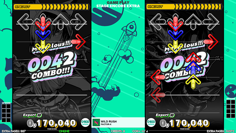
Hey, why does Wild Rush have Japanese text where its title is supposed to be?
Out of all the criticisms on here, I most strongly agree with the opinion that the song covers should be spaced out a bit more. Though it probably looks a bit better on a new save file where there aren't different Flare colors all over the place.
Hey, why does Wild Rush have Japanese text where its title is supposed to be?
Post #111 · Posted at 2024-05-20 07:39:09pm 2 years ago
| SpyHunter29 | |
|---|---|
|
Member |
| 371 Posts | |
| | |
| Reg. 2008-06-09 | |
That Japanese text simply says "decision" or "selection".
Post #112 · Posted at 2024-05-21 02:13:38am 2 years ago
| GhostSpirit | |
|---|---|
 |
Member |
| 249 Posts | |
| Not Set | |
| Reg. 2018-08-17 | |
| " ( 0﹏0)" | |
Quote: DBHxgiga92
I'm curious how well the options selected translate into those squares on the sides of the gameplay screen, not to mention what the background will do when there is no video. For all we know, Emi and Rage aren't the only new makeovers, but they can't show why just yet.
Probably those spaces are for the options icons, though maybe the screenshots don't have one for 1x since it's the default option? Also hopefully the background won't be static because honestly, this looks kinda barebones.
Not sure if someone noticed but apparently encore extra stage may be coming back according to this screenshot? (besides notice how they seem to be playing the same chart even though P1's is missing some notes lol)
Post #113 · Posted at 2024-05-21 02:57:59am 2 years ago
| salt814 | |
|---|---|
 |
Member |
| 99 Posts | |
| | |
| Reg. 2021-01-22 | |
That looks like different CONSTANT settings. EES has been back since A3 with Hou
Post #114 · Posted at 2024-05-21 03:05:33am 2 years ago
| hollandaze | |
|---|---|
 |
Member |
| 511 Posts | |
| | |
| Reg. 2011-01-19 | |
I think the problem is that the contrast is like, inverted. Your eyes go to the more vivid green and colorful character art instead of the black text boxes. That's what works about the A-A3 style wheel, is that it's either all one color or the background is darker than the foreground.

Post #115 · Posted at 2024-05-21 07:31:10am 2 years ago
here's my very rushed take on the UI done in illustrator, I decided to rush because doing this at 2am in the morning is a bad idea and I'm sleepy af so until I feel like I decide to revisit this, this is what you get from me
but yeah, toned down the saturation, adjusted placement of elements, tried recreating some of the text and then I gave up halfway through, nevertheless, tried to make things more streamlined while keeping the UI more organized (and yes no characters)

but yeah, toned down the saturation, adjusted placement of elements, tried recreating some of the text and then I gave up halfway through, nevertheless, tried to make things more streamlined while keeping the UI more organized (and yes no characters)
Post #116 · Posted at 2024-05-21 01:51:08pm 2 years ago
| SpyHunter29 | |
|---|---|
|
Member |
| 371 Posts | |
| | |
| Reg. 2008-06-09 | |
Now that you mention it, it could be possible to swap between the keypad and the Groove Radar on the lower corners of the menu by pressing one of the keys. Based on the latest screenshots, a few of them are still unused (3, 0, and 00).
On that note, I was wondering what some of the keypad labels (namely 2, 5, and 7) say, since in the screenshots we've seen so far, they're too small for me to translate.
On that note, I was wondering what some of the keypad labels (namely 2, 5, and 7) say, since in the screenshots we've seen so far, they're too small for me to translate.
Post #117 · Posted at 2024-05-21 04:14:06pm 2 years ago
| Trip Machina | |
|---|---|
 |
Member |
| 386 Posts | |
| | |
| Reg. 2006-06-09 | |
I didn't recognize Rage until people pointed it out. I wonder how Afro's gonna look with this new radical art direction...perhaps his afro will spike-out like a super saiyan this time around? Lol
The UI this time around looks simplified with pastel-like colors, which is bland compared to previous installments. Also, the dancing gameplay interface reminds me of Dance Dance Revolution (PS3) [2011]. Either way, I'm quite interested in seeing how Dance Dance Revolution WORLD turns out moving forward.
The UI this time around looks simplified with pastel-like colors, which is bland compared to previous installments. Also, the dancing gameplay interface reminds me of Dance Dance Revolution (PS3) [2011]. Either way, I'm quite interested in seeing how Dance Dance Revolution WORLD turns out moving forward.

Post #118 · Posted at 2024-05-21 06:53:23pm 2 years ago
| ledgam3r1279 | |
|---|---|
 |
Member+ |
| 1,003 Posts | |
| | |
| Reg. 2011-10-14 | |
| "now led_light for short" | |
Quote: SpyHunter29
On that note, I was wondering what some of the keypad labels (namely 2, 5, and 7) say, since in the screenshots we've seen so far, they're too small for me to translate.
2 and 5 are "Difficulty Change Up/Down", 7 is "Back" (to folder select, I assume)
Post #119 · Posted at 2024-05-21 07:25:08pm 2 years ago
| jabashque | |
|---|---|
 |
Member |
| 2 Posts | |
| Not Set | |
| Reg. 2023-02-04 | |
Quote: GhostSpirit
(besides notice how they seem to be playing the same chart even though P1's is missing some notes lol)
I mean, it's a screenshot showing off the CONSTANT mod (which is based off how the arrows faded in in Hou on DDR A3) and how each player can set different durations for the max amount of time a note can appear on the screen, so it's to be expected that P1 appears to be missing some notes.Post #120 · Posted at 2024-05-23 09:47:14am 2 years ago
| NikkiS | |
|---|---|
 |
Member |
| 293 Posts | |
 | |
| Reg. 2017-06-09 | |
| ""Hands Up Will Live On"" | |
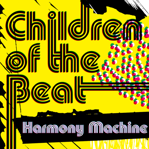
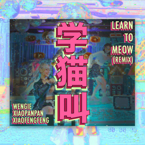
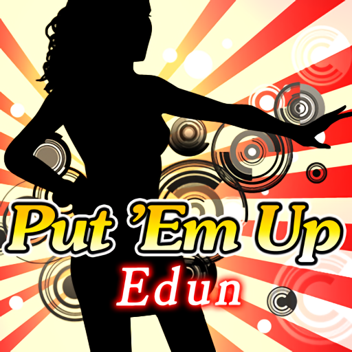
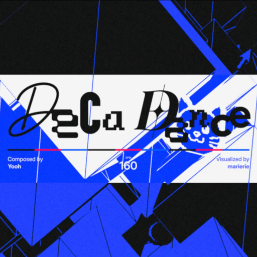
The first wave of new songs has been announced.
First off, the 25th Anniversary song contest winners:
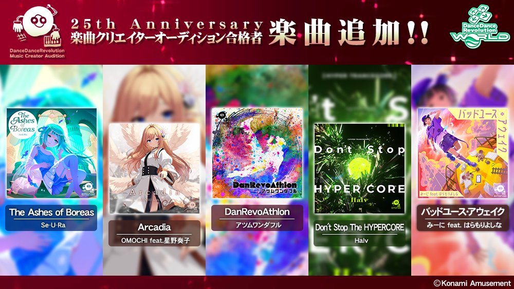
And some new licenses; No Tears Left to Cry from A20 is also revived.
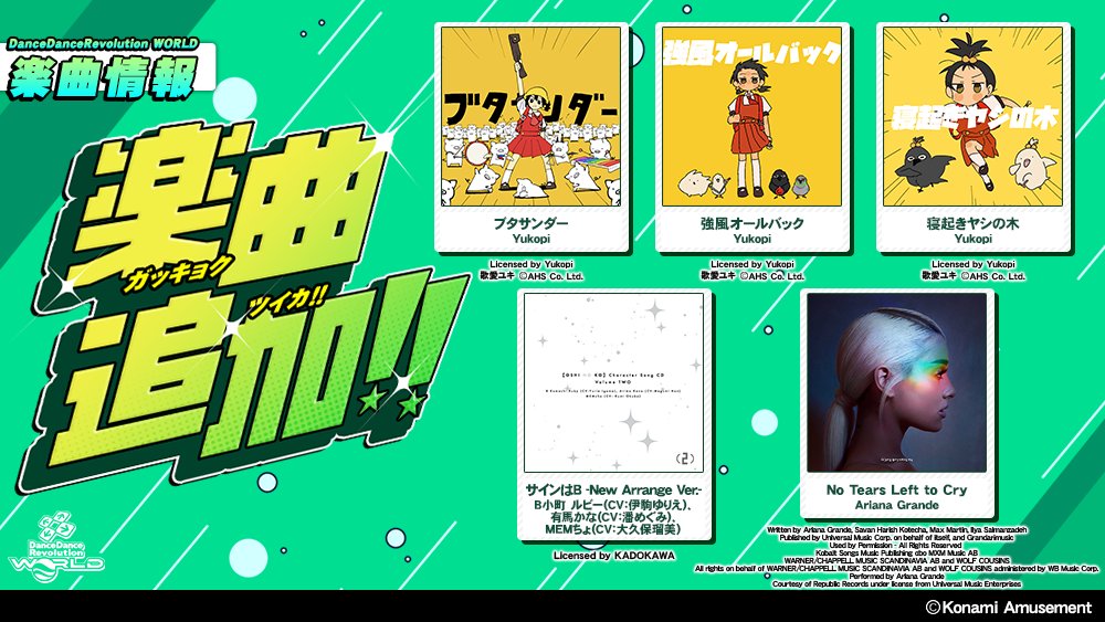
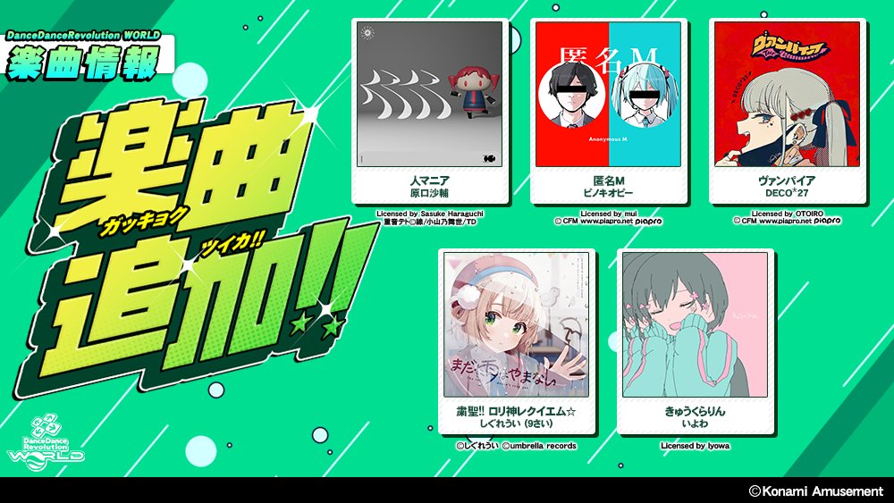
First off, the 25th Anniversary song contest winners:
And some new licenses; No Tears Left to Cry from A20 is also revived.