
Post #1061 · Posted at 2012-02-27 02:44:48am 14.3 years ago
 Aegis Aegis | |
|---|---|
 |
Member |
| 9,369 Posts | |
 | |
| Reg. 2009-04-16 | |
| "." | |
Well, a simple guide as to how to get what you got would be something.
Post #1062 · Posted at 2012-02-27 04:27:36am 14.3 years ago
| silverdragon754 | |
|---|---|
 |
Member+ |
| 1,497 Posts | |
| | |
| Reg. 2006-09-26 | |
  | |
| "Gods Must Be Strong" | |
Last updated: 2012-02-27 04:29am
Oh ok I see. Ok well, first and foremost, I use Photoshop (Ps) and Illustrator (Ai) to create all of my work both here on Zenius and professionally. They are the industry standard in design and the ones I was trained in all these years since I started.
For the SAKURA bg, I got a screenshot of the bg video and imported it into Ai and traced it. I know people usually find Ai a little confusing to use but it shares alot of the same features with Ps so it's not too hard to get used to. Keep in mind that the best tool in Ai is the renowned Pen Tool and that is key into tracing complex images. The thing is, you have to trace every detail possible to get a really nice picture in the end. it's also necessary to learn about Spline Curves and Beziere Curves in Ai because those can help you depending on what you want to achieve. I drew everything starting with her hair, eyes, ears, nose, etc and then vectored all the shadows I could find to make her look more detailed. IF YOU WERE HERE remix used ALOT of shadows and highlights and using Ps to try and get that effect isn't always best so that's why vectoring those extra details is crucial to making a nice illustration.
Once I was done, I get each piece I drew and dragged them into Ps to apply colors, shadows, gradients and all that good stuff. Since everything made in Ai is a vector image, it will be imported into Ps as such so you don't have to worry about it pixelating hence why I always get those nice crisp, clean images on my backgrounds. I basically put all the pieces of the drawing together like a puzzle and I organize them all into folders in Ps so they are easier to find(IF YOU WERE HERE, POSSESSION, and SAKURA had at least 50 different layers.)
Once the image is assembled the way you want it, you have to examine it carefully to try and find any imperfections or mistakes and fix them to make it all look more pro. Sample the colors from the original image so you can get as close as possible to it and always remember to have your PSD document set to RGB mode since none of this will be printed.

All of those light blue markers indicate each and every detail I had to re-draw and this is only about half or so.
I'm not saying this to be a jerk but I do see several people use alot of default Filters, fonts, gradients and shadows on their work and that gets tiring after so long. Each of those effects have values you can change and effects within effects so play around with them to get interesting results. Same goes for overlaying images on each other, use the Blending options carefully and use the right ones for the right occasions. Here's some color theory so sorry but it helps: in terms of Shadows, you have to think a little more, If you have an object sitting on a red canvas and you want to add a Shadow effect to it, logic says that this shadow will have a strong red hue to it, not just simply black. All of this really only applies to people who have Ps or Ai so I can't really help people who have GIMP or one of those other art programs but I'm sure they all share several similarities. Ai is also the way I recreate fonts that don't exist such as Dragon Blade or RED ZONE and you can also tweak existing typefaces in there too so it's very helpful when I need to create a font that I do not want anybody else copying.
I think the best thing to do if people want more in depth help is to show me an image of an effect they want to achieve and I can break it down into steps or something. Even if you want to know how I did something in one of my own bgs, I'll be happy to help out with that too. I do have secrets of my own that I can't disclose but there's always more than one way to do something so it shouldn't be much of a problem.
For the SAKURA bg, I got a screenshot of the bg video and imported it into Ai and traced it. I know people usually find Ai a little confusing to use but it shares alot of the same features with Ps so it's not too hard to get used to. Keep in mind that the best tool in Ai is the renowned Pen Tool and that is key into tracing complex images. The thing is, you have to trace every detail possible to get a really nice picture in the end. it's also necessary to learn about Spline Curves and Beziere Curves in Ai because those can help you depending on what you want to achieve. I drew everything starting with her hair, eyes, ears, nose, etc and then vectored all the shadows I could find to make her look more detailed. IF YOU WERE HERE remix used ALOT of shadows and highlights and using Ps to try and get that effect isn't always best so that's why vectoring those extra details is crucial to making a nice illustration.
Once I was done, I get each piece I drew and dragged them into Ps to apply colors, shadows, gradients and all that good stuff. Since everything made in Ai is a vector image, it will be imported into Ps as such so you don't have to worry about it pixelating hence why I always get those nice crisp, clean images on my backgrounds. I basically put all the pieces of the drawing together like a puzzle and I organize them all into folders in Ps so they are easier to find(IF YOU WERE HERE, POSSESSION, and SAKURA had at least 50 different layers.)
Once the image is assembled the way you want it, you have to examine it carefully to try and find any imperfections or mistakes and fix them to make it all look more pro. Sample the colors from the original image so you can get as close as possible to it and always remember to have your PSD document set to RGB mode since none of this will be printed.
All of those light blue markers indicate each and every detail I had to re-draw and this is only about half or so.
I'm not saying this to be a jerk but I do see several people use alot of default Filters, fonts, gradients and shadows on their work and that gets tiring after so long. Each of those effects have values you can change and effects within effects so play around with them to get interesting results. Same goes for overlaying images on each other, use the Blending options carefully and use the right ones for the right occasions. Here's some color theory so sorry but it helps: in terms of Shadows, you have to think a little more, If you have an object sitting on a red canvas and you want to add a Shadow effect to it, logic says that this shadow will have a strong red hue to it, not just simply black. All of this really only applies to people who have Ps or Ai so I can't really help people who have GIMP or one of those other art programs but I'm sure they all share several similarities. Ai is also the way I recreate fonts that don't exist such as Dragon Blade or RED ZONE and you can also tweak existing typefaces in there too so it's very helpful when I need to create a font that I do not want anybody else copying.
I think the best thing to do if people want more in depth help is to show me an image of an effect they want to achieve and I can break it down into steps or something. Even if you want to know how I did something in one of my own bgs, I'll be happy to help out with that too. I do have secrets of my own that I can't disclose but there's always more than one way to do something so it shouldn't be much of a problem.

Post #1063 · Posted at 2012-02-27 10:33:10am 14.3 years ago
EDIT: Sorry 
as an example you can reformulate this background?

as an example you can reformulate this background?
Post #1064 · Posted at 2012-02-27 10:46:35am 14.3 years ago
| chewi | |
|---|---|
 |
Member+ |
| 8,696 Posts | |
| | |
| Reg. 2008-02-24 | |
 | |
Please don't quote the post if it's right above yours.
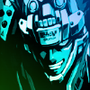
Nice IF YOU WERE HERE remix bg, Dan.
Nice IF YOU WERE HERE remix bg, Dan.

Post #1065 · Posted at 2012-03-02 08:49:20am 14.3 years ago
| silverdragon754 | |
|---|---|
|
Member+ |
| 1,497 Posts | |
| | |
| Reg. 2006-09-26 | |
| |
| "Gods Must Be Strong" | |
Thank you Chewy. 

Samsung? Yes, please.
Samsung? Yes, please.
Post #1066 · Posted at 2012-03-02 08:50:20am 14.3 years ago
| al2k4 | |
|---|---|
 |
Admin |
| 9,424 Posts | |
 | |
| Reg. 2006-05-01 | |
| |
| "BEMANI Sound Team" | |
SAMSUNG'D very much.
Post #1067 · Posted at 2012-03-02 08:50:22am 14.3 years ago
| chewi | |
|---|---|
|
Member+ |
| 8,696 Posts | |
| | |
| Reg. 2008-02-24 | |
| |
Very nice!! :O
Post #1068 · Posted at 2012-03-02 12:20:34pm 14.3 years ago
| AeronPeryton | |
|---|---|
 |
Member+ |
| 4,338 Posts | |
 | |
| Reg. 2007-03-03 | |
| "Give me a steady beat." | |
Quote: al2k4
SAMSUNG'D very much.
This. And as much as I want to see the X3s I hope the remaining SuperNOVA - X2 songs get done too. :3
Post #1069 · Posted at 2012-03-02 12:25:17pm 14.3 years ago
| KKiONI | |
|---|---|
 |
Member |
| 2,471 Posts | |
 | |
| Reg. 2007-12-06 | |
| "BEEJAY REVEL A" | |
OMG That background looks amazing, Dan. I'm so putting that as a background on my Xbox.

Post #1070 · Posted at 2012-03-03 12:12:27am 14.3 years ago
| Silverhawke | |
|---|---|
 |
Member+ |
| 4,606 Posts | |
 | |
| Reg. 2009-01-27 | |
 | |
| "highwind fluffdragon" | |
I was trying to do Tribe's background. Why the hell I started my first background on such a complicated stuff?!
Anyway, still a WIP. What do you guys think about it?

Anyway, still a WIP. What do you guys think about it?
Post #1071 · Posted at 2012-03-03 12:31:33am 14.3 years ago
| NXCProduction | |
|---|---|
 |
Member |
| 1,770 Posts | |
| | |
| Reg. 2011-03-01 | |
| " | |
woah. awesome. 
*put that as main BG*
*put that as main BG*

Post #1072 · Posted at 2012-03-03 05:33:25am 14.3 years ago
| AeronPeryton | |
|---|---|
|
Member+ |
| 4,338 Posts | |
| | |
| Reg. 2007-03-03 | |
| "Give me a steady beat." | |
Silverhawke, that looks very nice.
Post #1073 · Posted at 2012-03-05 06:58:48am 14.3 years ago
| silverdragon754 | |
|---|---|
|
Member+ |
| 1,497 Posts | |
| | |
| Reg. 2006-09-26 | |
| |
| "Gods Must Be Strong" | |
Last updated: 2012-03-06 03:32am
Few updated:


Post #1074 · Posted at 2012-03-05 07:16:22am 14.3 years ago
| Lord Toon | |
|---|---|
 |
Member |
| 1,616 Posts | |
| | |
| Reg. 2006-11-14 | |
 | |
| "lordtoon.com" | |
Konoko no nanatsu no oiwaini came out sweet...//


Post #1075 · Posted at 2012-03-05 07:17:17am 14.3 years ago
| Michael1991 | |
|---|---|
 |
Member |
| 360 Posts | |
| | |
| Reg. 2008-11-12 | |
| |
Your BGs is...totally...wicked...[SHORT PAUSE] AWESOME!!!!!!!!
Post #1076 · Posted at 2012-03-05 08:51:33am 14.3 years ago
| solarbeam92 | |
|---|---|
| Member | |
| 72 Posts | |
 | |
| Reg. 2011-12-29 | |
*faints at the sight of uber-awesomeness*

Post #1077 · Posted at 2012-03-05 03:18:04pm 14.2 years ago
| Silverhawke | |
|---|---|
|
Member+ |
| 4,606 Posts | |
| | |
| Reg. 2009-01-27 | |
| |
| "highwind fluffdragon" | |

Post #1078 · Posted at 2012-03-05 05:35:00pm 14.2 years ago
| silverdragon754 | |
|---|---|
|
Member+ |
| 1,497 Posts | |
| | |
| Reg. 2006-09-26 | |
| |
| "Gods Must Be Strong" | |
Last updated: 2012-03-05 05:36pm
Two more updated. Thanks again to DMAxel for the character in Votum stellarum. Looks like I'll be going full throttle again now that I got a special something that helped me improve~


Post #1079 · Posted at 2012-03-05 09:10:55pm 14.2 years ago
| seishinbyou | |
|---|---|
 |
Member |
| 617 Posts | |
| | |
| Reg. 2010-07-08 | |
| |
| "Wow, 4 types of corn!" | |
Very nice work. I only have one small complaint with the title for この子の七つのお祝いに
The つ after the 七 is a bit too low. The top of the つ should look like it flows almost in a straight line from the upward arch of the line through 七. It may seem like something small but it is really noticeable. Here are some samples to show what I'm talking about:
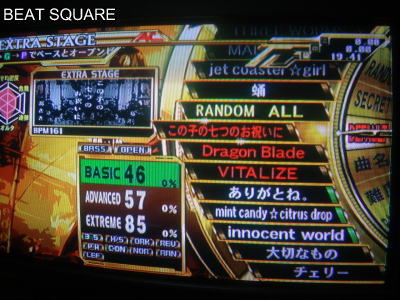

The actual (most common) back story/interpretation of この子の七つのお祝いに is pretty dark and creepy, but that is unrelated to this thread and I remember posting something about it in the Random Things in DDR thread anyways.
The つ after the 七 is a bit too low. The top of the つ should look like it flows almost in a straight line from the upward arch of the line through 七. It may seem like something small but it is really noticeable. Here are some samples to show what I'm talking about:
The actual (most common) back story/interpretation of この子の七つのお祝いに is pretty dark and creepy, but that is unrelated to this thread and I remember posting something about it in the Random Things in DDR thread anyways.

Post #1080 · Posted at 2012-03-06 12:26:07am 14.2 years ago
| Rodrigo2552 | |
|---|---|
 |
Member |
| 71 Posts | |
 | |
| Reg. 2011-12-18 | |
Nice backgrounds!  , i like Tribe, is a good song :b