
Post #61 · Posted at 2024-05-16 10:09:29am 2 years ago
 Quickman Quickman | |
|---|---|
 |
Member+ |
| 6,090 Posts | |
 | |
| Reg. 2013-08-17 | |
| "five minute white boy challenge" | |
Last updated: 2024-05-16 10:09am
Quote: BlueSupernova22
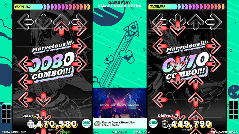
I hope to god they do not use generic static backgrounds or some shit for gameplay that would make this look waaay too stepmania like.
Anyone else feel a sort of Gitadora energy to this UI?
Oh, yeah, by the way:

"Mervelous"
Fair to say these are very much just mockups.
Post #62 · Posted at 2024-05-16 10:10:17am 2 years ago
| Burtzman | |
|---|---|
 |
Member |
| 736 Posts | |
 | |
| Reg. 2011-06-03 | |
I am not ready to look at that shade of green for the entire game.
Post #63 · Posted at 2024-05-16 11:54:48am 2 years ago
| Dogman1227 | |
|---|---|
 |
Member |
| 320 Posts | |
| | |
| Reg. 2011-02-27 | |
 | |
| "*no witty comment available* " | |
If they killed off support for CRT cabinets to also kill off the dance stages and characters all together, this is gonna be shit.
Post #64 · Posted at 2024-05-16 12:05:45pm 2 years ago
| Quickman | |
|---|---|
|
Member+ |
| 6,090 Posts | |
| | |
| Reg. 2013-08-17 | |
| "five minute white boy challenge" | |
Last updated: 2024-05-16 12:06pm
I wouldn't mind them killing off the stages all together if it means we get fresh and unique BGAs for each song, but... that's probably not happening. What's more likely here is a static image is being used as to not "spoil" whatever is actually going on in the background of gameplay.
Post #65 · Posted at 2024-05-16 02:31:51pm 2 years ago
| Silver Spirit | |
|---|---|
 |
Member |
| 6,790 Posts | |
| | |
| Reg. 2008-09-14 | |
 | |
| "i want things to be beautiful" | |
Quote: Quickman
Anyone else feel a sort of Gitadora energy to this UI?
The BGA being in a tiny box in the center makes it feel more like Beatmania THE FINAL.Also RIP the Groove Radar 2001-2024
Post #66 · Posted at 2024-05-16 03:17:24pm 2 years ago
 gotmilk0112 gotmilk0112 | |
|---|---|
| Member | |
| 191 Posts | |
| | |
| Reg. 2018-01-28 | |
I mean I wanted something new instead of another reskin of the Ace UI, but....this is way too different lmao
Everything just looks so cluttered and messy. There's too many UI elements and they clash with the background, making everything just look like a smattering of text and boxes. I think if you removed the two character images and just had the green background, that alone would make things look a lot neater.
Everything just looks so cluttered and messy. There's too many UI elements and they clash with the background, making everything just look like a smattering of text and boxes. I think if you removed the two character images and just had the green background, that alone would make things look a lot neater.
Post #67 · Posted at 2024-05-16 03:26:55pm 2 years ago
| Silver Spirit | |
|---|---|
|
Member |
| 6,790 Posts | |
| | |
| Reg. 2008-09-14 | |
| |
| "i want things to be beautiful" | |
I do agree that the character images take up WAY too much room on the song selection screen. Here's hoping they're not that big in the final release.
Post #68 · Posted at 2024-05-16 03:42:22pm 2 years ago
| black4ever | |
|---|---|
 |
Member |
| 895 Posts | |
 | |
| Reg. 2011-06-26 | |
Yeah the interface is a little much for the eyes. It's like everything's scaled equally large and fighting for attention. The way the numbers are aligned on the difficulty section just throws me off. Also, the way the character images are scaled that large and staring at me the whole time, that'll make me DEEPLY uncomfortable as an autistic not liking that level of eye contact.
I guess Rage overtakes Disco and maybe Baby-Lon as the main (male) mascot of DDR now?
This got me wondering. With the color scheme they're sticking with, will it stay that way for both gold and standard cabinets? Interesting how they're straying away from that.
I guess Rage overtakes Disco and maybe Baby-Lon as the main (male) mascot of DDR now?
This got me wondering. With the color scheme they're sticking with, will it stay that way for both gold and standard cabinets? Interesting how they're straying away from that.


Post #69 · Posted at 2024-05-16 05:38:52pm 2 years ago
| BlueSupernova22 | |
|---|---|
 |
Member |
| 90 Posts | |
| | |
| Reg. 2015-12-24 | |
I also noticed the combo is an immediate quad number and does not start as just 0. I hope thats not a thing too and that would make it a little hard to read it. Also i dont think any song has a thousand notes. (Except maybe Max 360 but i digress) Regardless that quadnumber combo should stay in courses or something.
Post #70 · Posted at 2024-05-16 06:31:50pm 2 years ago
| n00b_saib0t | |
|---|---|
 |
Member |
| 2,455 Posts | |
| | |
| Reg. 2007-02-05 | |
 | |
| "F***ing exhausted." | |
Quote: Quickman
I wouldn't mind them killing off the stages all together if it means we get fresh and unique BGAs for each song, but... that's probably not happening. What's more likely here is a static image is being used as to not "spoil" whatever is actually going on in the background of gameplay.
It says the stage is Encore Extra and the site talks about Galaxy Mode, so my guess is this BG is specifically part of that.Post #71 · Posted at 2024-05-16 09:30:06pm 2 years ago
| Quickman | |
|---|---|
|
Member+ |
| 6,090 Posts | |
| | |
| Reg. 2013-08-17 | |
| "five minute white boy challenge" | |
Quote: black4ever
This got me wondering. With the color scheme they're sticking with, will it stay that way for both gold and standard cabinets? Interesting how they're straying away from that.
I really hope so, we need to just standardize the software so that players of both cabinets get to play the exact same game. It's not fair to punish people playing on standard cabinets. It's not like they're the ones who chose the bloody version that their arcade got.
Post #72 · Posted at 2024-05-17 12:45:05am 2 years ago
| L33tAliceIp | |
|---|---|
 |
Member |
| 531 Posts | |
| | |
| Reg. 2011-10-06 | |
| |
| "Prepare for disappointment" | |
I hope to God that this is an early concept design. It's not right without the Groove Radar. Also, I wonder of the future of the dancers.

Post #73 · Posted at 2024-05-17 03:01:32am 2 years ago
| Quickman | |
|---|---|
|
Member+ |
| 6,090 Posts | |
| | |
| Reg. 2013-08-17 | |
| "five minute white boy challenge" | |
The Groove Radar only got more and more useless with each mix and it's not like it was exceptionally useful even back when it first debuted. It's about time it got axed.
Post #74 · Posted at 2024-05-17 03:07:56am 2 years ago

I seriously hope these screenshots are just mockups, like, the gameplay screen looks too busy? Especially the combo counter, it looks waaaaay too big.
Hopefully they won't completely get rid of the background characters. Not going to lie, part of this UI feels like those "lightweight" Stepmania themes people usually make lol.
Edit: Apparently the website does say these screenshots might differ from the final version? Still, it's so odd to see them remove some things that have been unique to DDR.
Post #75 · Posted at 2024-05-17 04:01:41am 2 years ago
Quote: Quickman
The Groove Radar only got more and more useless with each mix and it's not like it was exceptionally useful even back when it first debuted. It's about time it got axed.
yeah but people are NEVER gonna stop complaining about it now if so. it's gonna be 2035 and you're still gonna be hearing "bring the groove radar back, bring the groove radar back!".
(people may or may not include me)
Post #76 · Posted at 2024-05-17 04:47:52am 2 years ago


honestly, i have mixed feelings about the new UI, but they mostly lean towards positive:
PROS:
- the intent/direction behind the new art style is phenomenal IMO, it's very flashy, simple, but not too plain-looking
- EVERYTHING, almost, EVERYTHING got an overhaul in terms of UI placement and design elements, it feels like Konami went back from scratch and built the whole UI from there instead of making changes to the already existing SuperNova UI structure that's been there since 2006
- I love the fonts, they're DDR HP3-II + REFLEC BEAT coded in a good way
- the new options are welcome and it's about time they added more speed mods!!!
- is EES gonna be a more normal thing instead of being reserved for grinding events? i'd love that tbh
- BPM display in-game is a welcome addition
No thoughts:
- The lack of a groove radar honestly went by me, but that might bc of how cluttered the UI feels (which I will highlight in the next section), I also don't doubt Konami will add a toggle for the groove radar to appear in the song select a la 2014
CONS:
- The way the UI is executed is quite messy and I'm certainly not alone in this sentiment. The text and assets feel very cluttered and placed haphazardly & the contrast between each UI element in the main gameplay screen for the difficulty bar is a particular offense alongside the difficulty select menu (both in the song wheel and in its' own dedicated screen). The text is very hard to distinguish for the difficulty select, the leading and size of the text needs to be adjusted (might as well overhaul the box in general LOL), and as for the difficulty bar, there should be some sort of bold, dark outline to make it easily readable at first glance on screen
- I sincerely hope there'll be actual visuals during gameplay (w/o them being too distracting), because otherwise, my delusional way of giving Konami the benefit of the doubt for retiring SD cabs was to finally upgrade in-game graphics is RUINED, and even though the website says these are placeholder screencaps, I highly doubt they'll change more than some text placements and minor UI elements

Post #77 · Posted at 2024-05-17 05:09:24am 2 years ago
| Saotome2U | |
|---|---|
 |
Member |
| 219 Posts | |
| | |
| Reg. 2007-01-19 | |
| "Makin' my rounds. | |
Yeah, I know it's been a minute since I've had the benefit of playing on a DDR cab, and yes I've been hoping for a new UI since I wasn't a fan of the A series, but I'm not a fan of any of how things look now. I usually try to be objectionable and fair to find positives with the cons of things to not be solely negative, but I agree with SomethingRandom -- it looks messy and cluttered.
To be quite frank, for me everything looks like something meant for a kids version DDR from back in the day. I do wonder what the general feedback from fans will be on this and if it will cause Konami to do a rehaul, but yeah....it ain't working for me.
To be quite frank, for me everything looks like something meant for a kids version DDR from back in the day. I do wonder what the general feedback from fans will be on this and if it will cause Konami to do a rehaul, but yeah....it ain't working for me.
Post #78 · Posted at 2024-05-17 09:39:25am 2 years ago

This new UI is an absolute rotted fucking eyesore holy shit. Who thought that seafoam green and black/gray with neon accents with giant colorful character art were a good combination. They should've simplified and modernized the design but instead they shittified it. And of all of the QoL changes they could make, they couldn't finally add song search functionality? To me the most obvious thing to add to game with over 1,000 songs and counting.
This screenshot specifically is making my eyes bleed. There's no flow to the menus, where it makes sense where to look next.

This screenshot specifically is making my eyes bleed. There's no flow to the menus, where it makes sense where to look next.

Post #79 · Posted at 2024-05-17 12:27:25pm 2 years ago
Quote: hollandaze
This screenshot specifically is making my eyes bleed. There's no flow to the menus, where it makes sense where to look next.
I wonder what's up with the roman numerals in the background of each of the song titles. 4, 5, 6, 7...skip the two Wild Rushs for some reason, 8, 9 then EX on Windy Fairy. Actually, there's slots next to the difficulty level and some of them are filled in with matching medals of some kind.
Post #80 · Posted at 2024-05-17 01:42:25pm 2 years ago
| black4ever | |
|---|---|
|
Member |
| 895 Posts | |
| | |
| Reg. 2011-06-26 | |
Quote: Burtzman
I wonder what's up with the roman numerals in the background of each of the song titles. 4, 5, 6, 7...skip the two Wild Rushs for some reason, 8, 9 then EX on Windy Fairy. Actually, there's slots next to the difficulty level and some of them are filled in with matching medals of some kind.
Those are Flare Gauges from the Babylon's Galaxy event in A3 being available in (I'm guessing) Normal Play in WORLD. These are also visible in the song selection screen when playing on Galaxy Play in A3 after clearing the Encore Extra Stage.
2 User(s) Viewing This Thread (Past 15 Minutes)
Biku and KurodaOkiayu.