
Post #401 · Posted at 2010-04-11 09:36:40am 16.2 years ago
 sillybear sillybear | |
|---|---|
 |
Banned |
| 534 Posts | |
| Not Set | |
| Reg. 2008-08-19 | |
| "Thanks for all your support." | |
May i know what font used inside score frame (the red ones marked LEVEL and its corresponding number)? its similar font in my collection has no curve on top part of letter.

Post #402 · Posted at 2010-04-11 10:21:56am 16.2 years ago
| Exor | |
|---|---|
 |
Member |
| 3,644 Posts | |
 | |
| Reg. 2008-05-29 | |
 | |
| "^ featured on Law & Order" | |
Just out of curiosity, what's the font used for the titles on the box spine for DDR EX2-SN2 US, Ultramix 3 & 4, Universe 1 & 2? It looks a bit similar to the font used on American highway signs.
Post #403 · Posted at 2010-04-11 11:08:55am 16.2 years ago
| silverdragon754 | |
|---|---|
 |
Member+ |
| 1,497 Posts | |
| | |
| Reg. 2006-09-26 | |
  | |
| "Gods Must Be Strong" | |
Quote: Exor
Just out of curiosity, what's the font used for the titles on the box spine for DDR EX2-SN2 US, Ultramix 3 & 4, Universe 1 & 2? It looks a bit similar to the font used on American highway signs.
It actually might be Blue Highway Bold
Post #404 · Posted at 2010-04-11 06:54:01pm 16.2 years ago
| e-s-g | |
|---|---|
 |
Member |
| 2,207 Posts | |
 | |
| Reg. 2007-11-16 | |
Quote: sillybear
May i know what font used inside score frame (the red ones marked LEVEL and its corresponding number)? its similar font in my collection has no curve on top part of letter.
Looks like Handel/Aerohttp://www.fonts101.com/fonts/view/Brandname/5554/Aero.aspx
Post #405 · Posted at 2010-04-11 07:18:19pm 16.2 years ago
| Oni-91 | |
|---|---|
 |
Moderator+ |
| 13,526 Posts | |
| | |
| Reg. 2006-10-20 | |
 | |
| "Popular bisexual disaster" | |
Quote: Exor
Just out of curiosity, what's the font used for the titles on the box spine for DDR EX2-SN2 US, Ultramix 3 & 4, Universe 1 & 2? It looks a bit similar to the font used on American highway signs.
Do you have pics? The EU ones have different spine fonts for each version.
Post #406 · Posted at 2010-04-11 07:50:50pm 16.2 years ago
| sillybear | |
|---|---|
|
Banned |
| 534 Posts | |
| Not Set | |
| Reg. 2008-08-19 | |
| "Thanks for all your support." | |
Quote: e-s-g
Quote: sillybear
May i know what font used inside score frame (the red ones marked LEVEL and its corresponding number)? its similar font in my collection has no curve on top part of letter.
Looks like Handel/Aerohttp://www.fonts101.com/fonts/view/Brandname/5554/Aero.aspx
both a have flat top while those displayed in my sent image have curved top... any other?
Post #407 · Posted at 2010-04-11 08:29:41pm 16.2 years ago
| Oni-91 | |
|---|---|
|
Moderator+ |
| 13,526 Posts | |
| | |
| Reg. 2006-10-20 | |
| |
| "Popular bisexual disaster" | |
Looking really closely, it appears that the one in the image does have a flat top. The extra large border makes it look rounded.
Post #408 · Posted at 2010-04-11 08:35:09pm 16.2 years ago
| sillybear | |
|---|---|
|
Banned |
| 534 Posts | |
| Not Set | |
| Reg. 2008-08-19 | |
| "Thanks for all your support." | |
no, actually in DDRX2 img, the top part of letter L and V are rounded/curved even in my orig img at hand...
Post #409 · Posted at 2010-04-11 10:33:25pm 16.2 years ago
| Exor | |
|---|---|
|
Member |
| 3,644 Posts | |
| | |
| Reg. 2008-05-29 | |
| |
| "^ featured on Law & Order" | |
Quote: Oni-91
Quote: Exor
Just out of curiosity, what's the font used for the titles on the box spine for DDR EX2-SN2 US, Ultramix 3 & 4, Universe 1 & 2? It looks a bit similar to the font used on American highway signs.
Do you have pics? The EU ones have different spine fonts for each version.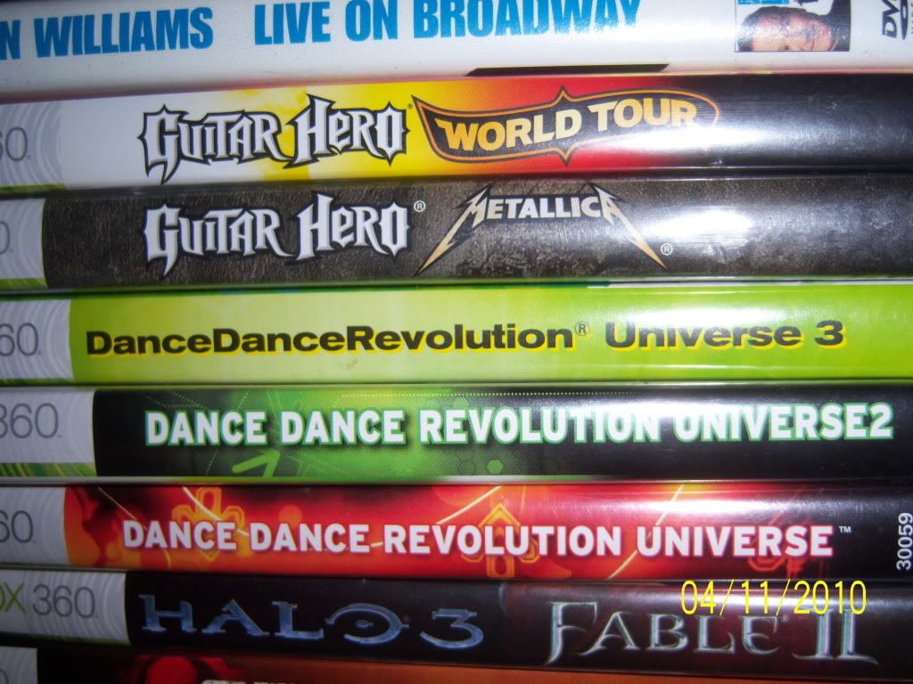
Post #410 · Posted at 2010-04-12 01:51:26am 16.2 years ago
| silverdragon754 | |
|---|---|
|
Member+ |
| 1,497 Posts | |
| | |
| Reg. 2006-09-26 | |
| |
| "Gods Must Be Strong" | |
Quote: sillybear
no, actually in DDRX2 img, the top part of letter L and V are rounded/curved even in my orig img at hand...
I looked over 27 files of the Handel family and none of them are rounded at the top. They either have an unreleased version of that typeface or they modified themselves. Or maybe the image itself is distorting the letters a bit for some reason...
Post #411 · Posted at 2010-04-12 08:41:02am 16.2 years ago
| Oni-91 | |
|---|---|
|
Moderator+ |
| 13,526 Posts | |
| | |
| Reg. 2006-10-20 | |
| |
| "Popular bisexual disaster" | |
Quote: silverdragon754
Quote: Exor
Just out of curiosity, what's the font used for the titles on the box spine for DDR EX2-SN2 US, Ultramix 3 & 4, Universe 1 & 2? It looks a bit similar to the font used on American highway signs.
It actually might be Blue Highway Bold
Post #412 · Posted at 2010-05-03 02:59:58am 16.1 years ago
| DJ OMiY | |
|---|---|
 |
Member |
| 1,766 Posts | |
| | |
| Reg. 2008-08-22 | |
| |
| "Mage Evangelist" | |
So uh, while browsing the web I stumbled across this in a webcomic...
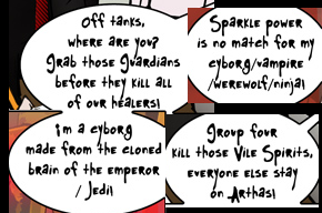
The text in the groove banner was a Font?
The text in the groove banner was a Font?

Post #413 · Posted at 2010-05-03 05:58:43am 16.1 years ago
| SpyHunter29 | |
|---|---|
 |
Member |
| 371 Posts | |
| | |
| Reg. 2008-06-09 | |
Quote: Exor
Quote: Oni-91
Quote: Exor
Just out of curiosity, what's the font used for the titles on the box spine for DDR EX2-SN2 US, Ultramix 3 & 4, Universe 1 & 2? It looks a bit similar to the font used on American highway signs.
Do you have pics? The EU ones have different spine fonts for each version.Post #414 · Posted at 2010-05-04 05:09:03am 16.1 years ago
| IIDXSucker8 | |
|---|---|
 |
Banned |
| 19 Posts | |
| | |
| Reg. 2010-05-04 | |
| "The sucker is back online." | |
what is the font for am-3p?


Post #415 · Posted at 2010-05-04 05:11:12am 16.1 years ago
| Oni-91 | |
|---|---|
|
Moderator+ |
| 13,526 Posts | |
| | |
| Reg. 2006-10-20 | |
| |
| "Popular bisexual disaster" | |
No, it's not Franklin Gothic. Closeish, but not quite.
Post #416 · Posted at 2010-05-04 07:08:49am 16.1 years ago
| Exor | |
|---|---|
|
Member |
| 3,644 Posts | |
| | |
| Reg. 2008-05-29 | |
| |
| "^ featured on Law & Order" | |
Quote: SpyHunter29
I was thinking something simpler: Franklin Gothic Heavy.
Strange that you mention Franklin Gothic, the font for the Product Number for DDR Universe 1 & 2.Post #417 · Posted at 2010-05-07 03:36:57pm 16.1 years ago


Post #418 · Posted at 2010-05-07 04:36:35pm 16.1 years ago
| TensaiKashou | |
|---|---|
 |
Member |
| 1,338 Posts | |
| | |
| Reg. 2009-05-31 | |
| |
| "◎" | |
(Doh, accidental post)
Post #419 · Posted at 2010-05-16 10:02:33am 16.1 years ago
| Lord Toon | |
|---|---|
 |
Member |
| 1,616 Posts | |
| | |
| Reg. 2006-11-14 | |
 | |
| "lordtoon.com" | |

Can anyone help me on what font that is? Its the Japanese Text under "Family Computer" ファミリーコンピュータ//
If anyone does have the font, I would like a copy please...//


Post #420 · Posted at 2010-05-16 10:34:00am 16.1 years ago
| AceJay | |
|---|---|
 |
Member+ |
| 893 Posts | |
| | |
| Reg. 2006-12-04 | |
It's Family Computer 