
Post #21 · Posted at 2008-06-29 05:28:55pm 17.9 years ago
 e-s-g e-s-g | |
|---|---|
 |
Member |
| 2,207 Posts | |
 | |
| Reg. 2007-11-16 | |
LOL, it's such a mess right now that I don't know if I should  Also, it's pretty damn big for a theme, I think it's 36MB, so I really need to fix that!! But since it DOES seem to be wanted, I'll definately consider it.
And what does everyone think about the groove radar? Yay or Nay?
I prefer having the groove radar, but it makes it cluttered, while GOLD has such a clean interface.
And what does everyone think about the groove radar? Yay or Nay?
I prefer having the groove radar, but it makes it cluttered, while GOLD has such a clean interface.
Post #22 · Posted at 2008-06-30 04:25:54am 17.9 years ago
| DialBM | |
|---|---|
 |
Member |
| 861 Posts | |
 | |
| Reg. 2008-06-08 | |
 | |
| "Number 001" | |
Maybe you can put a tiny groove-radar there, it's just a suggestion
Post #23 · Posted at 2008-06-30 05:02:03am 17.9 years ago
| Pandemonium X | |
|---|---|
 |
Member |
| 10,361 Posts | |
 | |
| Reg. 2007-04-06 | |
  | |
| "Is this thing still on?" | |
36MBs is not too bad for a theme. There's themes I've gotten that's over 200MBs.

Post #24 · Posted at 2008-06-30 05:07:38am 17.9 years ago
| e-s-g | |
|---|---|
|
Member |
| 2,207 Posts | |
| | |
| Reg. 2007-11-16 | |
Wow, they must have been some impressive themes!
And also, thanks a lot for the suggestion DialBM, I hadn't thought of that! I'll test it out soon
Oh yeah, and sorry for all the questions, since I'm still sucha n00b, but is it possible to change the position of the text on the song wheel, going up or down? I updated the section parts to direct rips, but they're smaller than what I had before so the text is too high up on the wheel. I'll try and provide a screenshot later...
Everyone that has helped so far is a Godsend, by the way
Post #25 · Posted at 2008-06-30 05:18:00am 17.9 years ago
| Kyzentun | |
|---|---|
 |
Member |
| 3,205 Posts | |
| | |
| Reg. 2008-02-20 | |
| "I'm honestly pissed off." | |
| Quote: Pandemonium X |
|---|
| 36MBs is not too bad for a theme. There's themes I've gotten that's over 200MBs. |
Sounds like somebody made a movie instead of a theme.
Post #26 · Posted at 2008-06-30 05:33:08am 17.9 years ago
| goemon4 | |
|---|---|
| Member | |
| 58 Posts | |
| | |
| Reg. 2007-10-18 | |
suggestions...
Get rid of where it says event, move banner up and put the groove radar underneath
for the ratings, where it says easy and hard, move them to those side boxes, and at the top where it dais easy and hard, pt like 1 and 10
Idk, how hard that would be, but just suggestions... nice theme btw, has potential
Post #27 · Posted at 2008-07-04 12:05:50am 17.9 years ago
| e-s-g | |
|---|---|
|
Member |
| 2,207 Posts | |
| | |
| Reg. 2007-11-16 | |
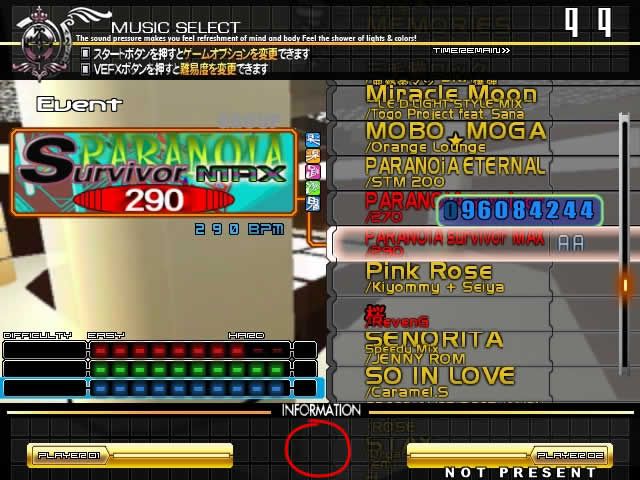
Ok, I haven't tried out any of the suggestions yet, only worked a little more on the song wheel, which might be nearing completion. And yeah, I know about the RANDOM.

goemon, I can't move the EASY and HARD labels to the side, since on the right I want to put the number rating, and on the left I need to figure out how to get the difficulty names showing up.
I moved up the difficulty list a little, because I want to have a little box there with scores etc., similar to GOLD CS. I'm also thinking about just ditching the groove radar later on, but I'll see what happens.
Post #28 · Posted at 2008-07-04 12:09:41am 17.9 years ago
| Kynayo | |
|---|---|
 |
Member |
| 2,756 Posts | |
 | |
| Reg. 2008-01-28 | |
| "キナヨ" | |
OMFG that is awesome!

Post #29 · Posted at 2008-07-04 12:10:13am 17.9 years ago
| PyroManiacX | |
|---|---|
 |
Member |
| 3,731 Posts | |
| | |
| Reg. 2007-09-23 | |
| "Not dead yet!" | |
Looks good so far! Can't wait to see it completed


Post #30 · Posted at 2008-07-04 12:30:01am 17.9 years ago
| Kynayo | |
|---|---|
|
Member |
| 2,756 Posts | |
| | |
| Reg. 2008-01-28 | |
| "キナヨ" | |
Oh hold on esg, why don't you put the score on or on top of the player 01 and player 02 part?
Post #31 · Posted at 2008-07-05 03:25:13am 17.9 years ago
| e-s-g | |
|---|---|
|
Member |
| 2,207 Posts | |
| | |
| Reg. 2007-11-16 | |
That was the idea.
And I've tried it out now, but I'm just gonna after keep Player 2's score data on the right with Player 1. B
Because the bottom information bar is over layed on top of the screen, which is why it covers the music wheel. So it would cover the score too on that side. I've had to cut that graphic in half and have the left side working just as a background and the right side as an overlay. It's a really cheap method, but ehhh.

Here's yet another screenshot of what it is looking like...
And I've tried it out now, but I'm just gonna after keep Player 2's score data on the right with Player 1. B
Because the bottom information bar is over layed on top of the screen, which is why it covers the music wheel. So it would cover the score too on that side. I've had to cut that graphic in half and have the left side working just as a background and the right side as an overlay. It's a really cheap method, but ehhh.
Here's yet another screenshot of what it is looking like...
Post #32 · Posted at 2008-07-05 04:05:10am 17.9 years ago
| mugentatsuya | |
|---|---|
 |
Member |
| 533 Posts | |
| | |
| Reg. 2007-09-18 | |
Wow, it's really starting to look nice.
Any possible way you can change the font of the score?
Any possible way you can change the font of the score?

Post #33 · Posted at 2008-07-05 09:04:26am 17.9 years ago
| adh2008 | |
|---|---|
 |
Banned |
| 317 Posts | |
 | |
| Reg. 2008-02-17 | |
Is this for SM3.9 or 4?
Either way, this is frackin awesometastic.
Either way, this is frackin awesometastic.

Post #34 · Posted at 2010-02-24 07:45:54am 16.2 years ago
| e-s-g | |
|---|---|
|
Member |
| 2,207 Posts | |
| | |
| Reg. 2007-11-16 | |
Anyone remember this?
Well I've been working on bits and pieces every now and then when I get a moment.
I've changed the font for the select music:

the font for the folders will probably change later. also can anyone tell me how to get rid of the "Single" in the lower center of the screen? I just recently got 3.9+ and so that showed up.
the life bar in gameplay:
http://i49.tinypic.com/1hxchh.jpg
bottom bar needs to be re done
and here's a screenshot of what the select mode looks like because i havent shown it yet but it was done aaages ago:
http://i50.tinypic.com/1t1kxz.jpg
it's pretty unspectacular right now.
select difficulty looks the same as this, except of course with difficulties. mode select will probably look completely different in the end, when i find out how to make it look like it is in Gold AC.
with SMTheming Wiki going down, i really hit a wall when making this, so I'll probably be back for more help when i run into a problem..
Well I've been working on bits and pieces every now and then when I get a moment.
I've changed the font for the select music:
the font for the folders will probably change later. also can anyone tell me how to get rid of the "Single" in the lower center of the screen? I just recently got 3.9+ and so that showed up.
the life bar in gameplay:
http://i49.tinypic.com/1hxchh.jpg
bottom bar needs to be re done
and here's a screenshot of what the select mode looks like because i havent shown it yet but it was done aaages ago:
http://i50.tinypic.com/1t1kxz.jpg
it's pretty unspectacular right now.
select difficulty looks the same as this, except of course with difficulties. mode select will probably look completely different in the end, when i find out how to make it look like it is in Gold AC.
with SMTheming Wiki going down, i really hit a wall when making this, so I'll probably be back for more help when i run into a problem..
Post #35 · Posted at 2010-02-24 12:23:46pm 16.2 years ago
| Saiiker | |
|---|---|
 |
Member |
| 109 Posts | |
| | |
| Reg. 2008-06-18 | |
| "Otherwise known as heyoRADIO." | |
Quote: e-s-g
can anyone tell me how to get rid of the "Single" in the lower center of the screen? I just recently got 3.9+ and so that showed up.
I'm not too great on themes, but I believe that can be fixed in the metrics with:
CurModeX=999
CurModeY=999
Under ScreenSelectMusic.
Post #36 · Posted at 2010-02-26 03:44:51am 16.2 years ago
| e-s-g | |
|---|---|
|
Member |
| 2,207 Posts | |
| | |
| Reg. 2007-11-16 | |
Thanks, that did the trick
Can anyone tell me what metrics I need to change to stop the musicwheel highlighter from glowing?
i've searched all over the metrics for "highlight" "glow" and other stuff to find it, but no luck.
Can anyone tell me what metrics I need to change to stop the musicwheel highlighter from glowing?
i've searched all over the metrics for "highlight" "glow" and other stuff to find it, but no luck.