
Post #2281 · Posté à 2016-08-12 04:42:00pm il y a 9.8 années
 KevinRocker10 KevinRocker10 | |
|---|---|
 |
Member |
| 328 Messages | |
 | |
| Reg. 2013-06-10 | |
| "well..." | |
One of the first things that I made in Fireworks 6 years ago. Oh the memories :,)


Post #2282 · Posté à 2016-08-13 02:14:47pm il y a 9.8 années
Ladies and gentlemen, good graphics. (well, in my point of view.)


Post #2283 · Posté à 2016-08-13 02:52:16pm il y a 9.8 années
| SM MaxX | |
|---|---|
 |
Member+ |
| 911 Messages | |
 | |
| Reg. 2012-08-30 | |
 | |
| "I play too much touhou" | |
bye

Post #2284 · Posté à 2016-08-13 04:47:36pm il y a 9.8 années
| TikalFan9000 | |
|---|---|
 |
Member |
| 1,860 Messages | |
 | |
| Reg. 2015-02-13 | |
 | |
| "c r e b" | |


Post #2285 · Posté à 2016-08-13 06:09:15pm il y a 9.8 années
| SM MaxX | |
|---|---|
|
Member+ |
| 911 Messages | |
| | |
| Reg. 2012-08-30 | |
| |
| "I play too much touhou" | |
See those are much better, though the banner just being a literal crop from the BG bugs me a tad bit
Post #2286 · Posté à 2016-08-13 10:14:39pm il y a 9.8 années
| XeneSyS 87 | |
|---|---|
 |
Member |
| 711 Messages | |
| | |
| Reg. 2012-04-17 | |
*sees THE BIG BLACK*
As much as I like the background, the banner is WAY too cluttered. Half of the word "THE" is obscured, and "the quick brown fox" is hard to read at 100% normal size. You'd have to look rather hard to find it. A slightly smaller font size would instantly make your title more readable, as long as each word doesn't overlap each other.
I like your ambition though. Keep trying, and you will get better at it.
Post #2287 · Posté à 2016-08-13 10:59:02pm il y a 9.8 années
| darkanine | |
|---|---|
 |
Member+ |
| 1,381 Messages | |
| | |
| Reg. 2014-06-30 | |
| "new phone who dis" | |
I actually like how the words overlap, it puts a major emphasis on BIG.
However i agree that the artist font is a bit unreadable
However i agree that the artist font is a bit unreadable
Post #2288 · Posté à 2016-08-14 10:20:53pm il y a 9.8 années
| TikalFan9000 | |
|---|---|
|
Member |
| 1,860 Messages | |
| | |
| Reg. 2015-02-13 | |
| |
| "c r e b" | |
have something that's NOT simfile graphics

:V
:V
Post #2289 · Posté à 2016-08-15 01:26:16pm il y a 9.8 années
New desktop wallpaper. Simple but I like it 
Pssst. If you want it with a custom text, send me a PM.

Pssst. If you want it with a custom text, send me a PM.
Post #2290 · Posté à 2016-08-15 06:02:08pm il y a 9.8 années
| DiscoStu | |
|---|---|
 |
Member |
| 53 Messages | |
 | |
| Reg. 2016-05-26 | |


Post #2291 · Posté à 2016-08-16 11:37:27pm il y a 9.8 années
| TikalFan9000 | |
|---|---|
|
Member |
| 1,860 Messages | |
| | |
| Reg. 2015-02-13 | |
| |
| "c r e b" | |
so i got miitomo and


well i don't know
well i don't know
Post #2292 · Posté à 2016-08-17 12:16:02pm il y a 9.8 années
| black4ever | |
|---|---|
 |
Member |
| 896 Messages | |
 | |
| Reg. 2011-06-26 | |
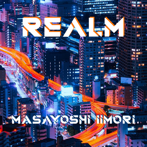
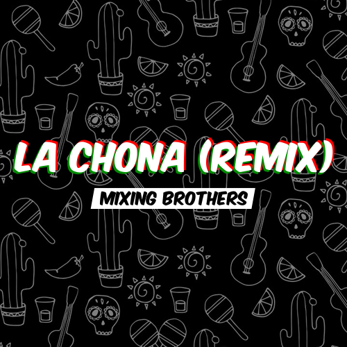
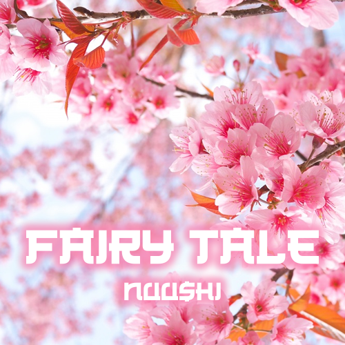
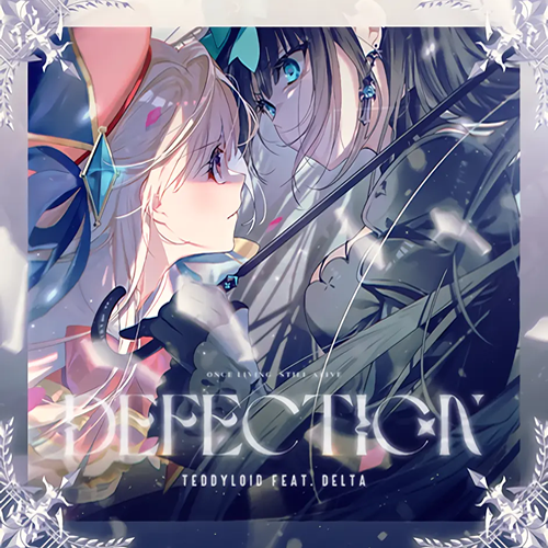
Did these a few days ago for my future simfiles.


Post #2293 · Posté à 2016-08-21 06:23:46am il y a 9.8 années


熱舞革命EXTREME3 中文曲特别版
DDR EXTREME3 CHINESE MUSIC SPECIAL EDITION

Post #2294 · Posté à 2016-08-21 08:53:20pm il y a 9.8 années
| 01angel | |
|---|---|
 |
Member |
| 2,755 Messages | |
| | |
| Reg. 2015-11-27 | |
 | |
| "Mostly just lurking." | |
This is not simfile graphics, but it's not a drawing so I guess this'll be the place I show y'all THIS. XD


Post #2295 · Posté à 2016-08-21 09:10:14pm il y a 9.8 années
| matsuten | |
|---|---|
 |
Moderator+ |
| 1,040 Messages | |
| | |
| Reg. 2014-08-03 | |
 | |
| "touch n go ride the flow" | |
pls

Post #2296 · Posté à 2016-08-21 09:39:07pm il y a 9.8 années
| SomethingRandom | |
|---|---|
 |
Member |
| 2,924 Messages | |
| | |
| Reg. 2015-02-21 | |
| |
| "bootylicious " | |
What is this

Post #2297 · Posté à 2016-08-21 09:40:16pm il y a 9.8 années
a masterpiece.
Post #2298 · Posté à 2016-08-21 09:43:30pm il y a 9.8 années
| SomethingRandom | |
|---|---|
|
Member |
| 2,924 Messages | |
| | |
| Reg. 2015-02-21 | |
| |
| "bootylicious " | |
It is not a masterpiece it is utter meme waste
I love it so much
I love it so much
Post #2299 · Posté à 2016-08-22 01:28:17pm il y a 9.8 années
| CYSYS8993 | |
|---|---|
 |
Member |
| 421 Messages | |
 | |
| Reg. 2015-07-02 | |
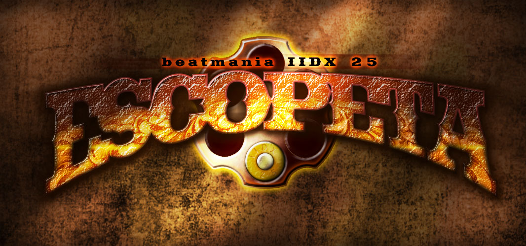
How's this for a logo design?
Post #2300 · Posté à 2016-08-22 01:57:48pm il y a 9.8 années
| 01angel | |
|---|---|
|
Member |
| 2,755 Messages | |
| | |
| Reg. 2015-11-27 | |
| |
| "Mostly just lurking." | |
OMG! It looks SO real! I absolutely adore it! 