
Post #2221 · Posted at 2016-05-24 04:37:24am 10 years ago
 BemaniHyper BemaniHyper | |
|---|---|
 |
Member+ |
| 1,435 帖子 | |
 | |
| Reg. 2013-09-13 | |
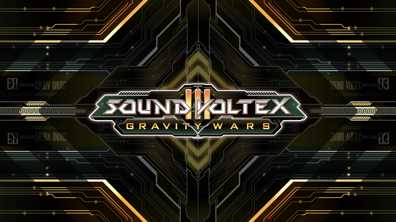
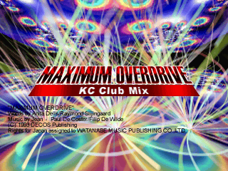
sdvx3 wallpaper
Post #2222 · Posted at 2016-05-24 12:47:54pm 10 years ago
| L33tAliceIp | |
|---|---|
 |
Member |
| 531 帖子 | |
| | |
| Reg. 2011-10-06 | |
  | |
| "Prepare for disappointment" | |
Last updated: 2016-05-24 12:49pm
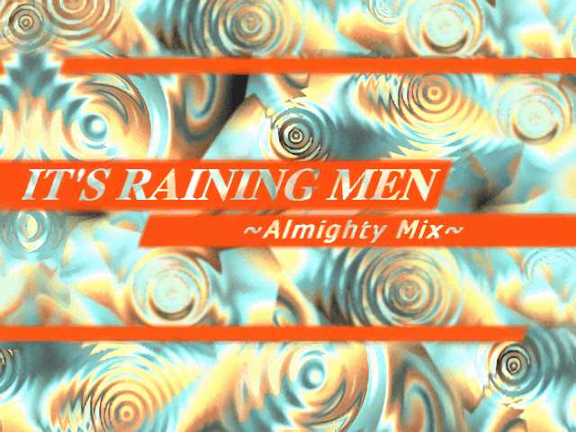
As I told darkanine, I am experimenting with gradients using GIMP. Here's an updated version Mysterious Times with a different text placement.


Post #2223 · Posted at 2016-05-24 02:03:22pm 10 years ago
| darkanine | |
|---|---|
 |
Member+ |
| 1,381 帖子 | |
| | |
| Reg. 2014-06-30 | |
| "new phone who dis" | |
That looks much better! However if you want to really make it pop, try adding a shadow beneath the text. 
Post #2224 · Posted at 2016-05-25 06:19:04am 10 years ago
Quote: L33tAliceIp


1. Background image choice. It should fit the mood of the song. The aspect ratio shouldn't be butchered by awkward stretching (ew ew ew). It shouldn't be low-res. (Seriously, some of these look like screengrabs from 240p YouTube videos.) One of my favorite sites for finding nice images is alpha.wallhaven.cc.
2. Usage of negative space. Text placement should generally take advantage of the negative space in a given image. If your image lacks negative space, you can create negative space with simple geometric shapes utilizing colors that compliment the rest of the image. (The text placement on your older version of "Mysterious Times" was technically better; it wasn't crowding the guy with the lightning.)
3. Font choice. This one's a bit harder to explain in objective terms, but…keep it simple, keep it legible. Personally, I like nice clean sans serif fonts. But a tasteful handwritten font or slightly more futuristic font can work sometimes too, depending on the mood/genre of the song and how obtrusive that font is versus your background image. Browse dafont.com; they break things down by category/mood.
4. Text coloring/effects. So many simfile authors make the mistake of thinking "more effects = more better". This is almost always wrong. Again, keep it simple. With a good background image and a nice font, you don't need to drown your text in gradients, strokes, and drop shadows. Get the basics down first, experiment with effects later. Text coloration should generally follow the color palette of the background image. (That "Cruel Summer" text is bright orange/yellow on top of a predominantly cool/blue image. Makes no sense. Ditto for the red/blue combo on that other one.)
Let's take a gander at some of my past atrocities and my more current takes on those banners:


Notice the trend? Clean and simple. My main point though is that we all start somewhere. Keep working at it and keep evolving. These banners are the evolution of my personal style. Let's also look at work by some other artists who I admire, but have markedly different styles than mine:
 Fraxtil
 Fraxtil
 Fraxtil
 Fraxtil
 Sudzi
Sudzi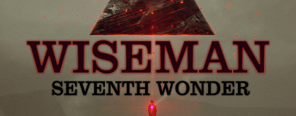 Sudzi
Sudzi Sudzi
Sudzi Sudzi
Sudzi Sudzi
SudziSome of these are heavier on layer effects than others, but they always accomplish the same thing: The text is legible while coexisting harmoniously with the accompanying image.
Post #2225 · Posted at 2016-05-25 08:10:18am 10 years ago
| CuzcoBlocko | |
|---|---|
 |
Member |
| 2,960 帖子 | |
| | |
| Reg. 2013-10-26 | |
| "[Art by LilyBreez]" | |
Does this apply to me? I do have some questionable graphics I made for simfiles in the past but none of them ever looked that wrong to me. (Flowlight and TAKE A LOOK AROUND may fit this criteria...)
Post #2226 · Posted at 2016-05-25 09:12:29am 10 years ago
| Chickenonline | |
|---|---|
 |
Member |
| 79 帖子 | |
| Not Set | |
| Reg. 2016-03-19 | |
| "鶏" | |
Quote: CuzcoBlocko
Does this apply to me? I do have some questionable graphics I made for simfiles in the past but none of them ever looked that wrong to me. (Flowlight and TAKE A LOOK AROUND may fit this criteria...)
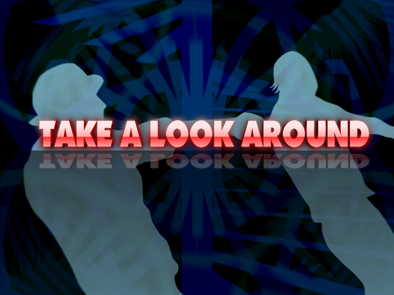
Can you see how the text is over the silhouettes? It's obviously hasn't used taken advantage negative space. Sadly, this background isn't appropriate for a proper background. Maybe if said silhouettes were removed, it'll be appropriate.
As for the text, it's ok, but the "3D" effect doesn't really work with a somewhat "flat" background (Shadows/Bevels may be OK in certain backgrounds though). Same problem with the reflection at the bottom.
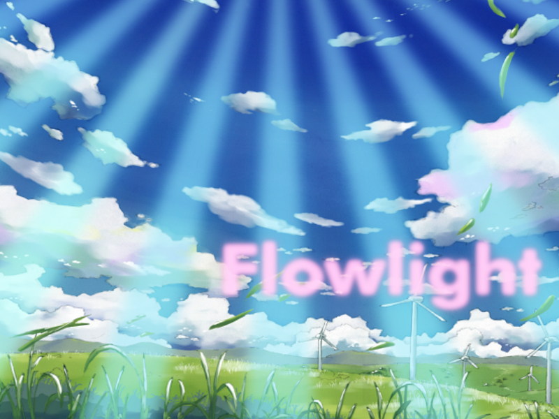
Again, the text hasn't taken advantage of the negative space (text is hovering over a wind turbine), and the text is blurry, thus rendering the text aesthetically unsightly. The colors used are also not appropriate. Bead.tk/color may help you pick a better color for background.
So, yes.
Post #2227 · Posted at 2016-05-25 10:26:00am 10 years ago
| 01angel | |
|---|---|
 |
Member |
| 2,755 帖子 | |
| | |
| Reg. 2015-11-27 | |
 | |
| "Mostly just lurking." | |
Quote: MUTE
I really, REALLY like this one.

Post #2228 · Posted at 2016-05-25 03:32:33pm 10 years ago
| L33tAliceIp | |
|---|---|
|
Member |
| 531 帖子 | |
| | |
| Reg. 2011-10-06 | |
| |
| "Prepare for disappointment" | |
I'm sorry MUTE but I am still learning how to make graphics. This is the first time I've ever done something like this, so it's bound to not look as good as others who have done this before and do it frequently. I'll try to follow people's advice as best as I can.
Post #2229 · Posted at 2016-05-25 04:55:00pm 10 years ago
| darkanine | |
|---|---|
|
Member+ |
| 1,381 帖子 | |
| | |
| Reg. 2014-06-30 | |
| "new phone who dis" | |
MUTE has definitely given great advice. But don't get discouraged, graphics takes practice. However definitely try to follow MUTE's advice. But honestly, the best way to improve making graphics is to do something unique in every one. Also creativity is just as important. Try to think outside the box in the graphics you make.
Post #2230 · Posted at 2016-05-25 06:32:55pm 10 years ago
| CuzcoBlocko | |
|---|---|
|
Member |
| 2,960 帖子 | |
| | |
| Reg. 2013-10-26 | |
| "[Art by LilyBreez]" | |
My graphics are heavily inspired by the DDR 1st-Extreme era.
Such problems are obvious then I guess.
That original clip is far too chaotic for a background and I'm not up for remastering it. However the text is a darker contrast compared to the whitened spirals background that makes it easy to pop.
Weird drop effects, to the point where the text has to be in little rectangle boxes.

Simplistic, but personally this one always bothered me because of the bland nature of this background (it's literally just yellow with text) and the rainbow is sliced.
Such problems are obvious then I guess.
That original clip is far too chaotic for a background and I'm not up for remastering it. However the text is a darker contrast compared to the whitened spirals background that makes it easy to pop.
Weird drop effects, to the point where the text has to be in little rectangle boxes.
Simplistic, but personally this one always bothered me because of the bland nature of this background (it's literally just yellow with text) and the rainbow is sliced.
Post #2231 · Posted at 2016-05-25 11:40:38pm 10 years ago


Post #2232 · Posted at 2016-05-26 02:21:15am 10 years ago
| matsuten | |
|---|---|
 |
Moderator+ |
| 1,040 帖子 | |
| | |
| Reg. 2014-08-03 | |
 | |
| "touch n go ride the flow" | |
I'm thinking maybe you like Mutsuhiko Izumi.
Post #2233 · Posted at 2016-05-26 06:42:43pm 10 years ago
Quote: hypnoticmarten77
I'm thinking maybe you like Mutsuhiko Izumi.
I was just remaking the graphics for some of my old simfiles.And yes, i like Mutsuhiko Izumi.


Post #2234 · Posted at 2016-05-26 09:42:51pm 10 years ago
| Arrows&Beats | |
|---|---|
 |
Banned |
| 2,594 帖子 | |
| | |
| Reg. 2011-08-13 | |
| |
| "Witch hunt victim." | |
I love how you used the font named Chicago for Chicago Blue.
Lately I've been feeling pretty bleh about making legitimate graphics since I've gotten bored of Acorn, so I'm doing this bs instead


Lately I've been feeling pretty bleh about making legitimate graphics since I've gotten bored of Acorn, so I'm doing this bs instead
Post #2235 · Posted at 2016-05-26 09:46:46pm 10 years ago
| Cowtao | |
|---|---|
 |
Member |
| 1,984 帖子 | |
| | |
| Reg. 2011-05-08 | |
| "This hat hurts" | |
Suddenly I don't want to ROCK THE SHOW anymore...

Post #2236 · Posted at 2016-05-27 04:03:15am 10 years ago
| MUTE | |
|---|---|
 |
Member |
| 74 帖子 | |
| | |
| Reg. 2007-06-27 | |
Quote: CuzcoBlocko
I do have some questionable graphics I made for simfiles in the past but none of them ever looked that wrong to me.
Heh. See, that's the problem. None of my older graphics "looked that wrong" to me either. They were my babies and I was proud of a lot of them. But one day I posted some stuff (Mute Sims 7 preview, I think) on FFR and had some people seriously critique the shit out of how bad they were. Not in a mean way or anything, it's just that there was definitely a lot that needed fixing. They showed me some good examples of better font usage, cleaner design, etc. It was eye-opening. From then on I've approached my graphics completely differently. And I dare say a decent amount of ITG step artists have followed suit and taken some inspiration from that.Quote: L33tAliceIp
I'm sorry MUTE but I am still learning how to make graphics. This is the first time I've ever done something like this, so it's bound to not look as good as others who have done this before and do it frequently. I'll try to follow people's advice as best as I can.
As I said, do not feel discouraged or like you need to apologize. Your first attempts at literally anything will always be bad. That's why I showed some of my older stuff as examples; we all make mistakes at first. I'd been meaning to post some graphics advice on ZiV for a while because I honestly see a lot of stuff on here that's, well…kinda really not great, to put it lightly. So that advice was definitely not just directed at you.I just kinda cringe when I see people post stuff like "yeah try adding a drop shadow!" Ha ha, no, don't just slap a drop shadow on something for shits and giggles. That's not good advice. Design is not just adding layer effects to text because it doesn't have any layer effects yet. Again, people go apeshit with strokes and gradients and drop shadows and it's not only unnecessary, it's just bad. Is there a time and a place for those things? Can they be used appropriately? Absolutely; look at Sudzi's graphics. I personally think Sudzi and Fraxtil are the two best graphic artists in the ITG community (with me and ChaosUnown maybe rounding out the top 4?). Look what the ones with skill are doing. Borrow elements from them. Mold them into your own personal style.
Post #2237 · Posted at 2016-05-27 04:18:51am 10 years ago
| SomethingRandom | |
|---|---|
 |
Member |
| 2,924 帖子 | |
| | |
| Reg. 2015-02-21 | |
| |
| "bootylicious " | |
Quote: Chickenonline
Quote: CuzcoBlocko
Does this apply to me? I do have some questionable graphics I made for simfiles in the past but none of them ever looked that wrong to me. (Flowlight and TAKE A LOOK AROUND may fit this criteria...)
Can you see how the text is over the silhouettes? It's obviously hasn't used taken advantage negative space. Sadly, this background isn't appropriate for a proper background. Maybe if said silhouettes were removed, it'll be appropriate.
As for the text, it's ok, but the "3D" effect doesn't really work with a somewhat "flat" background (Shadows/Bevels may be OK in certain backgrounds though). Same problem with the reflection at the bottom.
Again, the text hasn't taken advantage of the negative space (text is hovering over a wind turbine), and the text is blurry, thus rendering the text aesthetically unsightly. The colors used are also not appropriate. Bead.tk/color may help you pick a better color for background.
So, yes.

Post #2238 · Posted at 2016-05-27 05:12:25am 10 years ago
| CuzcoBlocko | |
|---|---|
|
Member |
| 2,960 帖子 | |
| | |
| Reg. 2013-10-26 | |
| "[Art by LilyBreez]" | |
The thing is, I strive to make my graphics as different as possible. I'm impaired in figuring out what REALLY REALLY fits the song so I just do what I can.
So, for instance...
These two are kind of the same. I mean, the background and font (and text obviously) are different, but there's definitely blatant similarities.
For the older ones...
I can see how this is off. The text is too thin and the banner as a whole feels rough in ways I can't exactly pinpoint.
I honestly think this looks good, I even slightly prefer it over the newer one a bit. (The other older ones, to me, some are hit, others are miss.)
Post #2239 · Posted at 2016-05-28 03:27:54pm 10 years ago


Post #2240 · Posted at 2016-05-29 05:42:44am 10 years ago
| chewi | |
|---|---|
 |
Member+ |
| 8,696 帖子 | |
| | |
| Reg. 2008-02-24 | |
| |


