Post #21 · Posted at 2012-05-12 04:54:39pm 12.3 years ago
 Oni-91 Oni-91 | |
|---|---|
 |
Moderator+ |
| 13,518 Posts | |
 | |
| Reg. 2006-10-20 | |
  | |
| "Popular bisexual disaster" | |
It also helps that the name is...fantastic.
Ocelot Piss. Wow.
Ocelot Piss. Wow.
Post #22 · Posted at 2012-05-12 09:33:17pm 12.3 years ago
| Lord Toon | |
|---|---|
 |
Member |
| 1,615 Posts | |
 | |
| Reg. 2006-11-14 | |
 | |
| "lordtoon.com" | |
I'm glad you guys are getting some use out of the fonts, Always experiment and flex those graphic muscles...//


Post #23 · Posted at 2012-05-13 12:09:17am 12.3 years ago
So there's no use of the previous font any longer ? Or are all the fonts free for use at any time ?
Took me some time to find a fitting song, to say it so
edit:

That song could almost be a twin of HALF MOON.
Took me some time to find a fitting song, to say it so
edit:
That song could almost be a twin of HALF MOON.
Post #24 · Posted at 2012-05-13 07:16:01am 12.3 years ago
| Lord Toon | |
|---|---|
|
Member |
| 1,615 Posts | |
| | |
| Reg. 2006-11-14 | |
| |
| "lordtoon.com" | |
Quote: Voyager006
So there's no use of the previous font any longer ? Or are all the fonts free for use at any time ?
You can use any of the fonts at any time...This is just an exercise in design.//Post #25 · Posted at 2012-05-13 09:02:52am 12.3 years ago


This is not exactly a banner/background for a song. I just did this to test Photoshop CS6. Quick job and very first time using CS6.


Post #26 · Posted at 2012-05-13 07:42:43pm 12.3 years ago
| Voyager006 | |
|---|---|
 |
Member |
| 53 Posts | |
 | |
| Reg. 2011-03-13 | |
Ah great Toon 
Aaanyway going on with the second font

Aaanyway going on with the second font
Post #27 · Posted at 2012-05-14 03:00:46am 12.3 years ago
| Wan | |
|---|---|
 |
Member |
| 412 Posts | |
 | |
| Reg. 2008-01-13 | |
| "I want to change my username =(" | |
A 2-in-1 banner!

Post #28 · Posted at 2012-05-17 08:17:05am 12.3 years ago
| Lord Toon | |
|---|---|
|
Member |
| 1,615 Posts | |
| | |
| Reg. 2006-11-14 | |
| |
| "lordtoon.com" | |
All of these are amazing! Keep it up!//
Also:

Link at the 1st Post.//
Also:
Link at the 1st Post.//
Post #29 · Posted at 2012-05-19 06:55:34am 12.3 years ago


[URBAN ELECTRO] PARANOiD / am2606
Post #30 · Posted at 2012-05-19 07:06:08am 12.3 years ago
| Lord Toon | |
|---|---|
|
Member |
| 1,615 Posts | |
| | |
| Reg. 2006-11-14 | |
| |
| "lordtoon.com" | |
Great use of that one Chewi☆!//
New Font at 1st Post:

New Font at 1st Post:
Post #31 · Posted at 2012-05-19 07:07:16am 12.3 years ago
| Max | |
|---|---|
 |
Member+ |
| 8,111 Posts | |
| | |
| Reg. 2008-02-05 | |
  | |
| "Charlie isn't real" | |
That reminds me of the "Gotta Dance" font....
Awesome work there Toon ^__^
Awesome work there Toon ^__^


Post #32 · Posted at 2012-05-22 09:21:39am 12.3 years ago
I hope you all enjoy the fonts I'm uploading for you guys...//

Link @ 1st Post.//
UPDATE: New font. Have fun with this one...//

NEW UPDATE: And yet another font to play with.//

Link @ 1st Post.//
UPDATE: New font. Have fun with this one...//
NEW UPDATE: And yet another font to play with.//
Post #33 · Posted at 2012-05-22 10:48:10am 12.3 years ago
| Silverhawke | |
|---|---|
 |
Member+ |
| 4,606 Posts | |
 | |
| Reg. 2009-01-27 | |
| |
| "highwind fluffdragon" | |
Amputa Bangiz looks strikingly similar to Slant, but different enough...
Post #34 · Posted at 2012-05-22 11:38:10am 12.3 years ago
| Professor Raine | |
|---|---|
 |
Member |
| 156 Posts | |
| | |
| Reg. 2007-08-19 | |
| "Look at me, I put BBCode here" | |
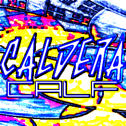
[HARDCORE BREAKBEAT] CALDERA - CALF
do~ooh

Post #35 · Posted at 2012-05-22 11:50:26am 12.3 years ago
| AeronPeryton | |
|---|---|
 |
Member+ |
| 4,338 Posts | |
 | |
| Reg. 2007-03-03 | |
| "Give me a steady beat." | |
That's pretty friggin' cool.
Post #36 · Posted at 2012-05-28 08:36:43am 12.3 years ago
| Telperion | |
|---|---|
 |
Member+ |
| 2,003 Posts | |
| | |
| Reg. 2009-04-25 | |
| |
| "btor2osly" | |
So many fonts to choose from now aaaaaaa~


Post #37 · Posted at 2012-05-29 02:36:18am 12.3 years ago
| Professor Raine | |
|---|---|
|
Member |
| 156 Posts | |
| | |
| Reg. 2007-08-19 | |
| "Look at me, I put BBCode here" | |
Last updated: 2012-05-29 03:26am
I'm getting a r21freak vibe from that banner. Like outer stroke much?
Also, the new font's pretty cool (no pun intended...I think...)
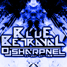
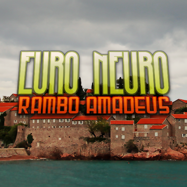
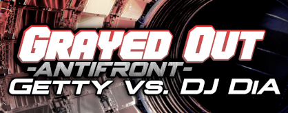
[HARDSTYLE] BLUE BETRAYAL - DJ SHARPNEL
Also, the new font's pretty cool (no pun intended...I think...)
[HARDSTYLE] BLUE BETRAYAL - DJ SHARPNEL
Post #38 · Posted at 2012-05-29 03:33:28am 12.3 years ago
I loooooove Outer Stroke - or, as the GIMPtards call it, Alpha to Selection --> Grow Selection --> Bucket Fill  And a lot of my gfx are designed at least partly with the ITG community in mind so there's that r21freak influence.
And nice use of that new font, it looks really good with the DJ Sharpnel logo.
And nice use of that new font, it looks really good with the DJ Sharpnel logo.
Post #39 · Posted at 2012-06-03 03:51:43am 12.3 years ago
| Wan | |
|---|---|
|
Member |
| 412 Posts | |
| | |
| Reg. 2008-01-13 | |
| "I want to change my username =(" | |
Last updated: 2012-06-03 08:28am
Jean-Jacques Perrey - Gossipo Perpetuo:


Notes:
1.- It's a bit annoying that the G looks like a C.
2.- Listen to the song to understand the usage of the LOL meme
Notes:
1.- It's a bit annoying that the G looks like a C.
2.- Listen to the song to understand the usage of the LOL meme
Post #40 · Posted at 2012-06-06 03:51:36pm 12.2 years ago
| Lord Toon | |
|---|---|
|
Member |
| 1,615 Posts | |
| | |
| Reg. 2006-11-14 | |
| |
| "lordtoon.com" | |
New Font has been uploaded...Check 1st Post for link...//